Hover the first 2 images
revision:
The CSS Paint API - part of the CSS Houdini umbrella of APIs - allows developers to write JavaScript functions that can draw directly into an element's background, border, or content.
It contains functionality allowing developers to create custom values for paint(), a CSS <image> function. These values can then be applied to properties - like background-image - to set complex custom backgrounds on an element.
The API is designed to enable developers to "programmatically define" images, which can then be used any where a CSS image can be invoked, such as CSS background-image, border-image, mask-image, etc.
The traditional approach to include an image is as follows:
div {
        background-image: url('path/to/background.jpg');
      }
This image is static.
Unlike static images, you can use the CSS Paint API to create dynamic backgrounds. With the CSS Painting API, you can call "the paint() function and" pass in a "worklet written in JS".
        div {
          background-image: paint(background);
        }
As of mid 2021, CSS Painting has been fully implemented in Chrome, Opera and Edge and is available in Firefox and Safari via a polyfill.
The API defines PaintWorklet, a worklet that can be used to programmatically - i.e by using JavaScript code - generate an image that responds to computed style changes. A worklet is an extension point into the browser rendering pipeline.
Avaliable interfaces include:
PaintWorklet: programmatically generates an image where a CSS property expects a file. This interface can be accessed through CSS.paintWorklet.
PaintWorkletGlobalScope: the global execution context of the paintWorklet.
PaintRenderingContext2D: implements a subset of the CanvasRenderingContext2D API. It has an output bitmap that is the size of the object it is rendering to.
PaintSize: returns the read-only values of the output bitmap's width and height.
Dictionaries: PaintRenderingContext2DSettings: a dictionary providing a subset of CanvasRenderingContext2D settings.
To programmatically create an image used by a CSS stylesheet we need to work through a few steps:
1/ define a paint worklet using the registerPaint() function;
2/ register the worklet;
3/ include the paint() CSS function.
First, we need to establish an element to style. We'll use a simple <div> element.
        <!-- index.html -->
        <div id="bubble-background"></div>
First of all, you need to add the paint() function to the CSS property you need your image to be on.
        div#bubble-background {
            width: 400px;
            height: 400px;
            background-image: paint(bubble);
          }
bubblePaint will be the worklet that we create to generate the images. This will be done in the next few steps.
The worklets need to be kept in an external JS file. The paint worklet would be a class . E.g.:- class Bubble { .... } . This worklet needs to be registered using the registerPaint() method.
        class Bubble {
            paint(context, canvas, properties) {
                ........
            }
        }
        registerPaint('bubble', Bubble);
The first parameter of the registerPaint() method should be the reference you included in CSS.
The next parameter should be a class with the paint() method.
The paint() method is where we write the JavaScript code to render the image.
Now let's draw the background.
        class Bubble {
            paint(context, canvas, properties) {
                const circleSize = 10;
                const bodyWidth = canvas.width;
                const bodyHeight = canvas.height;

                const maxX = Math.floor(bodyWidth / circleSize);
                const maxY = Math.floor(bodyHeight / circleSize);

                for (let y = 0; y <maxY; y++) {
                  for (let x = 0; x <maxX; x++) {
                    context.fillStyle = '#eee';
                    context.beginPath();
                    context.arc(x * circleSize * 2 + circleSize, y * circleSize * 2 + circleSize, circleSize, 0, 2 * Math.PI, true);
                    context.closePath();
                    context.fill();
                  }
               }
            }
        }
        registerPaint('bubble', Bubble);
The logic to create the image is inside the paint() method. You would need a bit of knowledge on canvas creation to draw images as above.
The final step would be to invoke the worklet in the HTML file.
        <div id="bubble-background"></div>
        <script>
        CSS.paintWorklet.addModule('. . . .js');
        </script>
        <style>
            li {background-image: paint(boxbg);--boxColor: hsla(55, 90%, 60%, 1.0);}
            li:nth-of-type(3n) {--boxColor: hsla(155, 90%, 60%, 1.0);--widthSubtractor: 20;}
            li:nth-of-type(3n+1) {--boxColor: hsla(255, 90%, 60%, 1.0);--widthSubtractor: 40;}
        </style>
        <div>
            <ul>
                <li>item 1</li>
                <li>item 2</li>
                <li>item 3</li>
                <li>item 4</li>
                <li>item 5</li>
                <li>item 6</li>
                <li>item 7</li>
                <li>item 8</li>
                <li>item 9</li>
                <li>item 10</li>
                <li>item 11</li>
                <li>item 12</li>
                <li>item 13</li>
                <li>item 14</li>
                <li>item 15</li>
                <li>item 16</li>
                <li>item 17</li>
                <li>item</li>
            </ul>
            <script>
                CSS.paintWorklet.addModule('boxbg.js');
            </script>
        <style>
            @property --border{ syntax: ''; inherits: true; initial-value: 0;}
            .box_a {padding:3vw 5vw; margin:0.5vw; font-size:3.5vw;  font-weight:bold; font-family:sans-serif; display:inline-block;
                cursor:pointer; position:relative; clip-path:polygon(var(--path)); transition:.5s;}
            .box_a:before{content:""; position:absolute; inset:0;-webkit-mask:paint(polygon-border); mask:paint(polygon-border); background:#000; }
            .box_a:hover { background:lightblue; }

        <div>
            <div class="box" style="--path:0 0,50% 20%,100% 0,90% 50%,100% 100%,50% 80%,0 100%, 10% 50%;--border:0.5vw;">
            Hover me </div>
            <div class="box" style="--path:20% 0,100% 0,100% 60%,80% 100%,0 100%,0 40%;--border: 0.3vw;"> Hover me </div>
            <div class="box" style="--path:20% 0,80% 0,100% 50%,80% 100%,20% 100%,0 50%; --border:1vw;"> Hover me </div>
            <div class="box" style="--path:0 0,85% 0,100% 50%,85% 100%,0 100%,15% 50%;--border: 0.6vw;padding:3vw 3vw 3vw 5vw">
            Hover me </div>
        </div>
        <script>
            if (CSS.paintWorklet) {
                CSS.paintWorklet.addModule('polygon-border.js');
            } else {
                alert("Your browser cannot run this demo. Consider Chrome or Edge instead")
            }
        </script>
        <style>
            @property --border{syntax: ''; inherits: true; initial-value: 0;}
            .box_b {--path:50% 0,100% 100%,0 100%; --border:0.5vw; margin:0.5vw 1vw; width:10vw;height:10vw; cursor:pointer;
                background:red; display:inline-block; clip-path:polygon(var(--path)); -webkit-mask:paint(polygon-border);mask:
                paint(polygon-border);}
        </style>
        <div>
            <div class="box_b"> </div>
            <div class="box_b" style="--path:50% 0%, 61% 35%, 98% 35%, 68% 57%, 79% 91%, 50% 70%, 21% 91%, 32% 57%, 2% 35%,
                39% 35%; --border:3px;
            background:repeating-conic-gradient(gold 0 36deg,purple 0 72deg)"> </div>
            <div class="box_b" style="--path:50% 0%, 90% 20%, 100% 60%, 75% 100%, 25% 100%, 0% 60%, 10% 20%;--border:10px;
                background:conic-gradient(blue,purple,orange, green,blue)"> </div>
            <div class="box_b" style="--path:50% 0%, 100% 30%, 50% 100%, 0% 30%; background:linear-gradient(45deg,red 50%,blue 0)">
            </div>
            <div class="box_b" style="--path:0% 15%, 15% 15%, 15% 0%, 85% 0%, 85% 15%, 100% 15%, 100% 85%, 85% 85%, 85% 100%,
            15% 100%, 15% 85%, 0% 85%;  background:linear-gradient(#000 40%,#0000 0 60%,grey 0)"> </div>
            <script>
            if (CSS.paintWorklet) {
                CSS.paintWorklet.addModule('polygon-border.js');
            } else {
                alert("Your browser cannot run this demo. Consider Chrome or Edge instead")
            }
            </script>
        </div>
        <div>
            <div class="box_c" style="--path:50% 0%, 61% 35%, 98% 35%, 68% 57%, 79% 91%, 50%  70%, 21% 91%, 32% 57%, 2% 35%,
                39% 35%;"></div>
                <div class="box_c" style="--path:50% 0%, 90% 20%, 100% 60%, 75% 100%, 25% 100%,  0% 60%, 10% 20%;--s:-1"></div>
            </div>
        <style>
           @property --border{syntax: '';minherits: true; initial-value: 0;}
            @property --offset{syntax: '';inherits: true;initial-value: 0;}
            .box_c {--border:0.25vw; --dash:15,10; --offset:0; width:20vw; height:20vw;
                display:inline-block; clip-path:polygon(var(--path)); position:relative;
                background:#eee; cursor:pointer;  animation:o 1.5s linear infinite;}
            .box_c:before {content:""; position:absolute; inset:0; background:#00a8c6;
            -webkit-mask:paint(polygon-border-2); mask:paint(polygon-border-2);}
            @keyframes o{
            to {--offset:calc(var(--s,1)*25)}
            }
        </style>
        <script>
            if (CSS.paintWorklet) {
                CSS.paintWorklet.addModule('polygon-border-2.js');
            } else {
                alert("Your browser cannot run this demo. Consider Chrome or Edge instead")
            }
        </script>
<style>
@property --f-b{syntax: ''; inherits: false; initial-value: 0;}
img {-webkit-mask:paint(blob); mask:paint(blob); cursor:pointer; border-radius:50%; --f-t:0; --f-b:0; transition:--f-b .5s;}
.static:hover {--f-b:30}
.dynamic {animation:b 1s infinite alternate linear;}
.dynamic-2 {--f-t:15; animation:b-2 2s infinite .75s cubic-bezier(.5,calc(var(--f-t)/(-.289*.1)),.5,calc(var(--f-t)/(.289*.1)));
}
@keyframes b {
to {--f-b:20}
}
@keyframes b-2 {
to {--f-b:0.1}
}
</style>
<div>
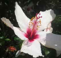
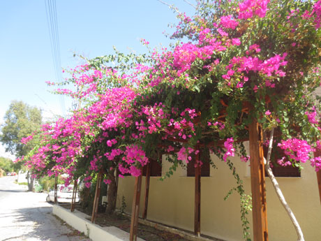
<h3>Hover the first 2 images
<img src="../images/img_white_flower.jpg" class="static" style="--f-r:0;--f-n:20;">
<img src="../images/img_pink_flowers.jpg" style="width:20%; --f-r:1;--f-n:20;" class="static">
<img src="../images/img_white_flower.jpg" style="--f-r:1;--f-n:25;" class="dynamic">
<img src="../images/img_pink_flowers.jpg" style=" width:20%; --f-r:1;--f-n:32;" class="dynamic-2">
<script>
if (CSS.paintWorklet) {
CSS.paintWorklet.addModule('blob.js');
} else {
alert("Your browser cannot run this demo. Consider Chrome or Edge instead")
}
</script>
</div>
<style>
@property --b{syntax: ''; inherits: false; initial-value: 0; }
img.one {border-radius:50%; cursor:pointer;-webkit-mask:paint(blob-2);mask:paint(blob-2);
--n:15; --b:0; transition:--b .5s; }
img.one:hover { --b:100 }
</style>
<div>
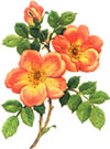
<img src="../images/img_orange_flowers.jpg" class="one" width="50%">
<script>
if (CSS.paintWorklet) {
CSS.paintWorklet.addModule('blob-2.js');
} else {
alert("Your browser cannot run this demo. Consider Chrome or Edge instead")
}
</script>
</div>