code:
Autumn is coming!


code:
<div>
<section>
<h3>Autumn is coming!</h3>
<div class="leaf">
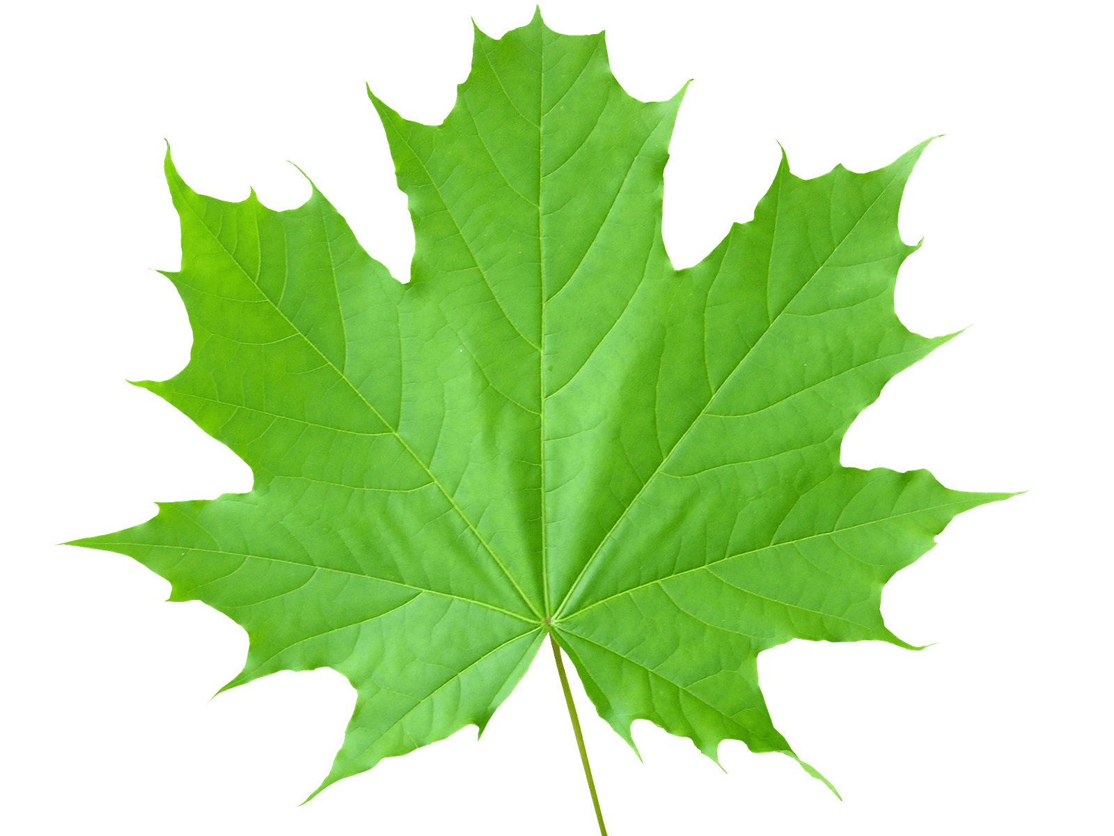
<div><img src="../images/Fall-Autumn-Leaves-Transparent-PNG.png" height="75px" width="75px"></img></div>
<div><img src="../images/Autumn-Fall-Leaves-Pictures-Collage-PNG.png" height="75px" width="75px"></img></div>
<div><img src="../images/Autumn-Fall-Leaves-Clip-Art-PNG.png" height="75px" width="75px" ></img></div>
<div><img src="../images/Green-Leaves-PNG-File.png" height="75px" width="75px"></img></div>
<div><img src="../images/Transparent-Autumn-Leaves-Falling-PNG.png" height="75px" width="75px"></img></div>
<div><img src="../images/Realistic-Autumn-Fall-Leaves-PNG.png" height="75px" width="75px"></div>
<div><img src="../images/Autumn-Leaves-PNG-HD.png" height="75px" width="75px"></div>
</div>
<div class="leaf leaf1">
<div><img src="../images/Fall-Autumn-Leaves-Transparent-PNG.png" height="75px" width="75px"></img></div>
<div><img src="../images/Autumn-Fall-Leaves-Pictures-Collage-PNG.png" height="75px" width="75px"></img></div>
<div><img src="../images/Autumn-Fall-Leaves-Clip-Art-PNG.png" height="75px" width="75px" ></img></div>
<div><img src="../images/Green-Leaves-PNG-File.png" height="75px" width="75px"></img></div>
<div><img src="../images/Transparent-Autumn-Leaves-Falling-PNG.png" height="75px" width="75px"></img></div>
<div><img src="../images/Realistic-Autumn-Fall-Leaves-PNG.png" height="75px" width="75px"></div>
<div><img src="../images/Autumn-Leaves-PNG-HD.png" height="75px" width="75px"></div>
</div>
<div class="leaf leaf2">
<div><img src="../images/Fall-Autumn-Leaves-Transparent-PNG.png" height="75px" width="75px"></img></div>
<div><img src="../images/Autumn-Fall-Leaves-Pictures-Collage-PNG.png" height="75px" width="75px"></img></div>
<div><img src="../images/Autumn-Fall-Leaves-Clip-Art-PNG.png" height="75px" width="75px" ></img></div>
<div><img src="../images/Green-Leaves-PNG-File.png" height="75px" width="75px"></img></div>
<div><img src="../images/Transparent-Autumn-Leaves-Falling-PNG.png" height="75px" width="75px"></img></div>
<div><img src="../images/Realistic-Autumn-Fall-Leaves-PNG.png" height="75px" width="75px"></div>
<div><img src="../images/Autumn-Leaves-PNG-HD.png" height="75px" width="75px"></div>
</div>
</section>
</div>
<style>
section{height:100%; width:100%; position:absolute; }
.leaf{position:absolute; width:100%; height:100%; top:0; left:0;}
.leaf div{position:absolute; display:block;}
.leaf div:nth-child(1){left:20%; animation:fall 15s linear infinite; animation-delay:-2s;}
.leaf div:nth-child(2){left:70%; animation:fall 15s linear infinite; animation-delay:-4s;}
.leaf div:nth-child(3){left:10%; animation:fall 20s linear infinite; animation-delay:-7s;}
.leaf div:nth-child(4){left:50%; animation:fall 18s linear infinite; animation-delay:-5s;}
.leaf div:nth-child(5){left:85%; animation:fall 14s linear infinite; animation-delay:-5s;}
.leaf div:nth-child(6){left:15%; animation:fall 16s linear infinite; animation-delay:-10s;}
.leaf div:nth-child(7){left:90%; animation:fall 15s linear infinite; animation-delay:-4s;}
@keyframes fall{
0%{opacity:1;top:-10%;transform:translateX(20px) rotate(0deg);}
20%{opacity:0.8;transform:translateX(-20px) rotate(45deg);}
40%{transform:translateX(-20px) rotate(90deg);}
60%{transform:translateX(-20px) rotate(135deg);}
80%{transform:translateX(-20px) rotate(180deg);}
100%{top:110%;transform:translateX(-20px) rotate(225deg);}
}
.leaf1{transform: rotateX(180deg);}
.leaf2{transform: rotateY(180deg);}
h3{position:absolute; top:40%; width:100%; font-family: 'Courgette', cursive; font-size:4em;
text-align:center; transform:translate;color:black; transform:translateY (-50%); }
</style>