The power of cartoons
Revision:
<div class="container">
<header id="top"><h1>The power of cartoons</h1></header>
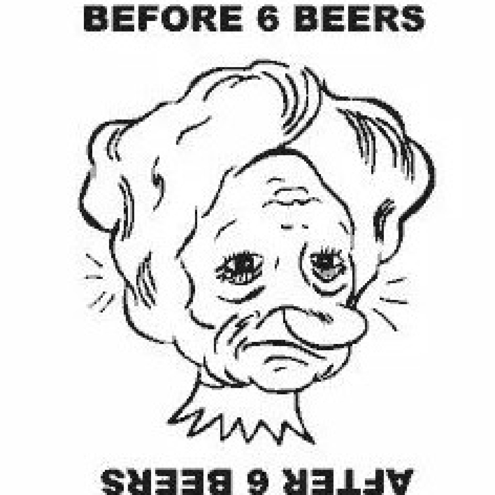
<img class="animation" src="../images/cartoon.jpg" alt="animation">
</div>
<style>
header{background: darkolivegreen; padding: 5px; overflow: hidden;}
header h1{font-weight: bold; text-align: center; font-size: calc(2 * 2vw); text-transform: uppercase; letter-spacing: calc(0.5 * 1vw); overflow: hidden;
background: linear-gradient(90deg, darkblue, #fff, darkred); background-repeat: no-repeat; background-size: 80%; animation: animate 9s linear infinite;
background-clip: text; -webkit-background-clip: text; -webkit-text-fill-color: rgba(255, 255, 255, 0);}
@keyframes animate {
0% {background-position: -400%;}
100% {background-position: 400%;}
}
.animation{position: absolute; top: 24vw;left: 0px; width: calc(4 * 2vw); border-radius: 25px;animation-name: roll; animation-duration: 10s; animation-fill-mode: both;
animation-iteration-count: infinite; animation-timing-function: linear;}
@keyframes roll {
from { left:0px;transform: rotate(0deg);}
to {left: 1560px; transform: rotate(360deg); }
}
</style>
            <header><h3>"A picture is worth a thousand words" - The story</h3></header>
            <style>
                header h3{background-color:darkgray; display: block; height: calc(9 * 1vw); text-align: center; color:darkblue;padding-top: 1vw;font-size: calc(3 * 1vw);
                    animation: move 5s infinite;}
                @keyframes move{
                    33%{ text-shadow: -1vw -2vw red;}
                    66%{ text-shadow: 1vw 2vw green;}
                    100%{ text-shadow: 0vw 0vw orange;}
                }
            </style>
            <div class="container">
                <header class="three"><h1>Passionate about food ?? </h1></header>
            </div>
            <style>
                header.three h1{display: block; height: 6vw; padding-top: 2vw; background-color: darkgray; font-size: calc(3 * 1vw);font-weight: bold; text-align: center;
                    letter-spacing: calc(0.3 * 1vw); color: darkgreen; overflow: hidden; animation: 5s slidein 1s alternate infinite;}
                @keyframes slidein{
                    from{transform: scaleX(0);}
                    to{transform: scaleX(1.5);}
                }
            </style>