grayscale()
blur()
revision:
            <div class="grid_A">
                <div>
                    <h3>grayscale()</h3>
                    <img id="one_" src="../images/1.jpg" alt="" width="20%"/>
                    <img id="two_" src="../images/1.jpg" alt="" width="20%"/>
                    <img id="three_" src="../images/1.jpg" alt="" width="20%"/>
                </div>
                <div>
                    <h3>blur()</h3>
                    <img id="four_" src="../images/1.jpg" alt="" width="20%"/>
                    <img id="five_" src="../images/1.jpg" alt="" width="20%"/>
                    <img id="six_" src="../images/1.jpg" alt="" width="20%"/>
                </div>
            </div>
            <style>
                #one_{filter: grayscale(0);}
                #two_{filter: grayscale(0.5);}
                #three_{filter: grayscale(1);}

                #four_{filter: blur(0vw);}
                #five_{filter: blur(0.5vw);}
                #six_{filter: blur(1vw);}
            </style>
            <div class="grid_A">
                <div>
                    <h3>sepia()</h3>
                    <img id="seven" src="../images/1.jpg" alt="" width="20%"/>
                    <img id="eight" src="../images/1.jpg" alt="" width="20%"/>
                    <img id="nine" src="../images/1.jpg" alt="" width="20%"/>
                </div>
                <div>
                    <h3>saturate()</h3>
                    <img id="ten_" src="../images/1.jpg" alt="" width="20%"/>
                    <img id="eleven_" src="../images/1.jpg" alt="" width="20%"/>
                    <img id="twelve_" src="../images/1.jpg" alt="" width="20%"/>
                </div>
            </div>
            <style>
                #seven_{filter: sepia(0);}
                #eight_{filter: sepia(0.5);}
                #nine_{filter: sepia(1);}

                #ten_{filter: saturate(0);}
                #eleven_{filter: saturate(2);}
                #twelve_{filter: saturate(4);}
            </style>
            <div class="grid_A">
                <div>
                    <h3>hue-rotate()</h3>
                    <img id="thirteen_" src="../images/1.jpg" alt="" width="20%"/>
                    <img id="fourteen_" src="../images/1.jpg" alt="" width="20%"/>
                    <img id="fifteen_" src="../images/1.jpg" alt="" width="20%"/>
                </div>
                <div>
                    <h3>invert()</h3>
                    <img id="one" src="../images/1.jpg" alt="" width="20%"/>
                    <img id="two" src="../images/1.jpg" alt="" width="20%"/>
                    <img id="three" src="../images/1.jpg" alt="" width="20%"/>
                </div>
            </div>
            <style>
                #thirteen_{filter: hue-rotate(0deg);}
                #fourteen_{filter: hue-rotate(90deg);}
                #fifteen_{filter: hue-rotate(240deg);}

                #one{filter: invert(0);}
                #two{filter: invert(0.55);}
                #three{filter: invert(1);}
            </style>
            <div class="grid_A">
                <div>
                    <h3>opacity()</h3>
                    <img id="four" src="../images/1.jpg" alt="" width="20%"/>
                    <img id="five" src="../images/1.jpg" alt="" width="20%"/>
                    <img id="six" src="../images/1.jpg" alt="" width="20%"/>
                </div>
                <div>
                    <h3>brightness()</h3>
                    <img id="seven" src="../images/1.jpg" alt="" width="20%"/>
                    <img id="eight" src="../images/1.jpg" alt="" width="20%"/>
                    <img id="nine" src="../images/1.jpg" alt="" width="20%"/>
                </div>
            </div>
            <style>
                #four{filter: opacity(0.1);}
                #five{filter: opacity(0.5);}
                #six{filter: opacity(1);}

                #seven{filter: brightness(0.2);}
                #eight{filter: brightness(1.2);}
                #nine{filter: brightness(2.2);}
            </style>
            <div class="grid_A">
                <div>
                    <h3>contrast()</h3>
                    <img id="ten" src="../images/1.jpg" alt="" width="20%"/>
                    <img id="eleven" src="../images/1.jpg" alt="" width="20%"/>
                    <img id="twelve" src="../images/1.jpg" alt="" width="20%"/>
                </div>
                <div>
                    <h3>drop-shadow()</h3>
                    <img id="thirteen" src="../images/1.jpg" alt="" width="20%"/>
                    <img id="fourteen" src="../images/1.jpg" alt="" width="20%"/>
                    <img id="fifteen" src="../images/1.jpg" alt="" width="20%"/>
                </div>
            </div>
            <style>
                #ten{filter: contrast(0.2);}
                #eleven{filter: contrast(1.2);}
                #twelve{filter: contrast(3);}
                #thirteen{filter: drop-shadow(0.5vw 0.5vw 0.5vw rgba(0,0,0,0.9));}
                #fourteen{filter: drop-shadow(1vw 1vw 1vw rgba(0,0,0,0.9));}
                #fifteen{filter: drop-shadow(1.6vw 1.6vw 1vw rgba(0,0,0,0.9));}
            </style>
 Saturate:
 filter: saturate(2);Hue Rotate: filter: hue-rotate(140deg);Invert: filter: invert(.8); Grayscale:
 filter: grayscale(1);Sepia: filter: sepia(100%);Blur: filter: blur(5px);Brightness: filter: brightness(.5);Contrast: filter: contrast(3);Combo: filter: contrast(1.4) saturate(1.8) sepia(.6);
            <h3 style="margin-left: -3vw;">summarizing image filters</h3>
            <ul class="gridA">
                <li><img class="saturate" src="../images/1.jpg?h=150&auto=compress"/>Saturate: <code>filter: saturate(2);</code></li>
                <li><img class="hue" src="../images/1.jpg?h=150&auto=compress"/>Hue Rotate: <code>filter: hue-rotate(140deg);</code></li>
                <li><img class="invert" src="../images/1.jpg?h=150&auto=compress"/>Invert: <code>filter: invert(.8);</code></li>
                <li><img class="greyscale" src="../images/1.jpg?h=350&auto=compress"/>Grayscale: <code>filter: grayscale(1);</code></li>
                <li><img class="sepia" src="../images/1.jpg?h=150&auto=compress"/>Sepia: <code>filter: sepia(100%);</code></li>
                <li><img class="blur" src="../images/1.jpg?h=350&auto=compress"/>Blur: <code>filter: blur(5px);</code></li>
                <li><img class="darken" src="../images/1.jpg?h=350&auto=compress"/>Brightness: <code>filter: brightness(.5);</code></li>
                <li><img class="contrast" src="../images/1.jpg?h=350&auto=compress"/>Contrast: <code>filter: contrast(3);</code></li>
                <li><img class="all-the-things" src="../images/1.jpg?h=350&auto=compress"/>Combo: <code>filter: contrast(1.4) saturate(1.8) sepia(.6);</code></li>
            </ul>
            <style>
                .greyscale{filter: grayscale(1);-webkit-filter: grayscale(1);}
                .sepia{filter: sepia(100%);-webkit-filter: sepia(1);-ms-filter: sepia(100%);}
                .blur{filter: blur(5px); -webkit-filter: blur(5px);}
                .saturate{filter: saturate(2);-webkit-filter: saturate(2);}
                .hue{filter: hue-rotate(140deg);-webkit-filter: hue-rotate(140deg);}
                .invert{filter: invert(.8);-webkit-filter: invert(.8);}
                .darken{filter: brightness(.5); -webkit-filter: brightness(.5);}
                .contrast{filter: contrast(2); -webkit-filter: contrast(2);}
                .all-the-things {filter: contrast(1.4) saturate(1.8) sepia(.6);-webkit-filter: contrast(1.4) saturate(1.8) sepia(.6);}
                button:hover{filter: opacity(.7); -webkit-filter: opacity(.7); text-shadow: -1px -1px 0px #000;}

                /* Remove effect on Hover */
                img:hover{filter: none; -webkit-filter: none; }

                /* Demo Styling */
                img{ max-width: 100%;}
                .gridA{ display: grid; grid-template-columns: repeat(5 , 1fr); justify-content: left; list-style: none;  margin: 0; padding: 0 2% 2%;text-align: left;}
                .gridA li{box-sizing: border-box; padding: 1vw; min-width: 10%; max-width: 25vw; color:blue; }
                .gridA li img{ transition: all .2s ease-in-out; -webkit-transition: all .2s ease-in-out; -moz-transition: all .2s ease-in-out;-o-transition: all .2s ease-in-out;
                    transform: translateX(0); -webkit-transform: translateX(0);}
            </style>
use "document.body.clientWidth" and "document.body.clientHeight"
The resizing task takes two functions, which can be inserted directly into the HTML source with <script< tags or into a standalone JS file.
            <div class="grid_A">
                <div>
                    <h3>using JavaScript to scale an image according to window size</h3>
                    <p> use "document.body.clientWidth" and "document.body.clientHeight"</p>
                    <div><img id="imgTag" src="../images/car2.jpg"  /> </div>
                </div>
                <div>
                    <h3>resizing images for a zoom effect</h3>
                    <p>The resizing task takes two functions, which can be inserted directly into the HTML source with <script< tags or into a standalone JS file.</p>
                    <div>
                        <img id="zoom_img" src="../images/car2.jpg" alt="car"/>
                    </div>
                    <button type="button" onclick="zoomin()"><img src="../images/zoom-in.png" style="width: 1vw; height: 1vw;">zoom in</button>
                    <button type="button" onclick="zoomout()"><img src="../images/zoom-out.jpg" style="width: 1vw; height: 1vw;">zoom out</button>
                </div>
            </div>
            <script>
                function scaleSize(){
                    document.getElementById("imgTag").style.width = document.body.clientWidth;
                    document.getElementById("imgTag").style.height = document.body.clientHeight;
                }
            </script>
            <script>
                function zoomin(){
                    var myImg = document.getElementById("zoom_img");
                    var currWidth = myImg.clientWidth;
                    if(currWidth >= 700){
                        alert("You're fully zoomed in!");
                    } else{
                        myImg.style.width = (currWidth + 100) + "px";
                    }
                }
                function zoomout(){
                    var myImg_1 = document.getElementById("zoom_img");
                    var currWidth_1 = myImg_1.clientWidth;
                    if(currWidth_1 <= 100){
                        alert("That's as small as it gets.");
                    } else{
                        myImg_1.style.width = (currWidth_1 - 100) + "px";
                    }
                }
            </script>
the combination of HTML, CSS, and JavaScript makes cool stuff possible : click and see image scaling
                <div>
                    <p>the combination of HTML, CSS, and JavaScript makes cool stuff possible : <span> click and see image scaling</span></p>
                    <div class="photo-container">
                            <img id="photo" src="../images/car2.jpg" alt="car"/>
                            <img id="photo" src="../images/cartoon.jpg" alt="cartoon"/>
                            <img id="photo" src="../images/desk.jpeg" alt="desk"/>
                            <img id="photo" src="../images/camera.png" alt="camera"/>
                    </div>
                </div>
                <style>
                    .photo-container{display: flex; flex-flow: row nowrap;}
                    .photo-container img {width: 20vw; height: 20vw; border: 0.2vw outset burlywood; margin-top: 3vw; margin-right: 3vw; cursor: pointer}
                    span{color: darkolivegreen;}
                    .scaleImage { animation: scaling-image-animation 5s ease;}
                    @keyframes scaling-image-animation {
                        0% { transform: scale(0.5); opacity: 0.8;}
                        50% {transform: scale(2); }
                        100% { transform: scale(2.5); transform: rotate(0.5turn);}
                    }
                </style>
                    <script>
                         const photos = Array.from(document.querySelectorAll('#photo'));
                         const scalingImage = (currentPhoto => {
                            currentPhoto.classList.add("scaleImage");
                            setTimeout(() => {
                               currentPhoto.classList.remove('scaleImage');
                            }, 4500);
                        })

                        photos.map((photo) => {
                           photo.addEventListener('click', Event => {
                              scalingImage(Event.target);
                           })
                        });

                    </script>
move an image to the right
flipping an image with JavaScript
        <div class="grid_A">
            <div class="spec">
                <h3>move image to the right</h3>
                <p>move an image to the right</p>
                <div>
                    <form>
                        <img id = "myImage" src = "../images/car2.jpg"/>
                        <p class="spec" style="margin-top: 1vw;">click button below to move the image to right</p>
                        <input style="margin-left: 2vw;" type = "button" value = "Click Me" onclick = "moveRight();" />
                        </form>
                </div>
            </div>
            <div class="spec">
                <h3>flip images horizontally with JavaScript</h3>
                    <p>flipping an image with JavaScript</p>
                    <div class="flip">
                    <img src="../images/car2.jpg" class="car" alt="car" />
                    </div>
            </div>
        </div>
        <style>
            .flip{display: flex; flex-direction: row; gap: 1vw;}
            .car{width: 20vw; height: 20vw;}
            canvas{width:20vw; height: 20vw;}
        </style>
        <script>
            var imgObj = null;
                function init() {
                    imgObj = document.getElementById('myImage');
                    imgObj.style.position = 'relative';
                    imgObj.style.left = '0px';
                }

                function moveRight() {
                    imgObj.style.left = parseInt(imgObj.style.left) + 10 + 'px';
                    if(imgObj.style.left >= 900 + "px"){
                        alert("far enough!");
                    }
                }
                window.onload = init;
        </script>
        <script>
            const inputImage = document.querySelector(".car");
            if (inputImage.complete) {
                flipImage();
            }
            else {
                inputImage.onload = flipImage;
            }

            function flipImage() {
                const outputImage = document.createElement("canvas");
                outputImage.width = inputImage.naturalWidth;
                outputImage.height = inputImage.naturalHeight;
                const ctx = outputImage.getContext("2d");
                ctx.scale(-1, 1);
                ctx.drawImage(inputImage, -outputImage.width, 0);
                inputImage.parentNode.insertBefore(
                    outputImage,
                    inputImage.nextElementSibling
                );
            }
        </script>
srcset allows you to define a list of different image resources along with size information so that the browser can pick the most appropriate image based on the actual device's resolution. Each comma-separated item in srcset has: image URL, an empty space, the actual width of the image or display density, either using display density descriptor (for example, 1.5x, 2x etc.) or using width descriptors (for example, 450w). This is the width of the image in pixels.
The syntax for display density descriptors is straightforward: srcset provides a comma-separated list of image resources along with display density it should be used (for example 1x, 2x etc.). When using width descriptor, the syntax is similar to the display density descriptor, but instead of display density values, we provide the actual width of the image.
syntax: <source srcset="URL">
            <picture>
                <source media="(min-width:650px)" srcset="img_pink_flowers.jpg">
                <source media="(min-width:465px)" srcset="img_white_flower.jpg">
                <img src="img_orange_flowers.jpg" alt="Flowers" style="width:auto;">
                </picture>
The srcset defines the set of images we will allow the browser to choose between, and what size each image is. Each set of image information is separated from the previous one by a comma. sizes defines a set of media conditions (e.g. screen widths) and indicates what image size would be best to choose, when certain media conditions are true. The "sizes" attribute contains a comma-separated list. Each item in the list describes the size of the image in relation to the viewport. Using the "sizes attribute" with srcset provides the browser with enough information to start downloading the right image as soon as it sees an <img> tag in HTML without waiting for styles sheets to complete downloading and parsing.
So, with these attributes in place, the browser will a/xlook at its device width, b/ work out which media condition in the sizes list is the first one to be true, c/ look at the slot size given to that media query, d/ load the image referenced in the srcset list that has the same size as the slot or, if there isn't one, the first image that is bigger than the chosen slot size.
            <div>
                <img src="../images/flowers.jpg"
                sizes="(max-width: 200px) 50vw, (min-width: 201px) 20vw"
                srcset="../images/flowers.jpg 500w, img_pink_flowers.jpg 50w" alt="great picture">
            </div>
If you need art direction - that is, to explicitly dictate the browser to load an entirely different image based on browser viewport or image format support, you need the <picture> element. The picture element should be used to achieve: art direction, different format support, or color theme example
The <picture> element consists of zero or more "source" and one "img" element. The browser will consider each source element to choose the best match based on device display and image format support. Each source accepts "media" and "type" attributes in addition to "srcset" and "sizes". The "media attribute" contains a media condition like CSS media query. If a source's element media condition evaluates to false, the browser skips that source. If none of the source element's media conditions evaluate to true, the browser loads the image specified in the "img tag". The "type attribute" specified the MIME type of the resource URL(s) in the source's srcset. If the browser supports that MIME type, it will load the resource. Otherwise, it will skip that source and move to the next. If none of the source's type is supported by the browser, the image in "img" is loaded.
Resize the browser window to load different images.
            <picture>
                <source media="(min-width:650px)" srcset="../images/img_pink_flowers.jpg">
                <source media="(min-width:465px)" srcset="../images/img_white_flower.jpg">
                <img src="../images/img_orange_flowers.jpg" alt="Flowers" style="width:auto;">
            </picture>
These hints allow the server to fulfill a particular request with the most optimal resource. The latter is known as "content negotiation".Client hints provide this information via HTTP request headers. Not every request has these HTTP headers. You will have to explicitly tell the browser to include these client hints using a "meta" tag.
If the width property is set to a percentage and the height property is set to "auto", the image will be responsive and scale up and down. If the max-width property is set to 100%, the image will scale down if it has to, but never scale up to be larger than its original size. If you want to restrict a responsive image to a maximum size, use the max-width property with a pixel value of your choice.
Background images can also respond to resizing and scaling: if the background-size property is set to "contain", the background image will scale, and try to fit the content area. However, the image will keep its aspect ratio (the proportional relationship between the image's width and height). If the background-size property is set to "100% 100%", the background image will stretch to cover the entire content area. If the background-size property is set to "cover", the background image will scale to cover the entire content area. Notice that the "cover" value keeps the aspect ratio, and some part of the background image may be clipped.
            <img src="1.jpg" alt="holiday"  class="responsive">
            <style>
                .responsive { width: 80%; height: auto; }
            </style>
The problem of extra 5px spacing at the bottom of a picture, can be solved in four ways.
            <div class="container">
                <img class="first" src="../images/1.jpg" alt="beach" width="20%" height="20%">
            </div>
            <style>
                .issue{width: 20vw; height: auto; }
                .container{width: 20vw; height:20.5vw; background-color:red; margin-left:5vw;}
            </style>
1: set "font-size: 0;" to parent element
2: set "display: block;" to img
3: set "vertical-align:bottom" to img
4: set "line-height: 5px;" to parent element
        <div class="grid_C">
            <div>
                <p>1: set "font-size: 0;" to parent element</p>
                <div class="container-1"><img class="first" src="../images/1.jpg" alt="beach" ></div>
            </div>
            <div>
                <p>2: set "display: block;" to img</p>
                <div class="container-2"><img class="second" src="../images/1.jpg" alt="beach"></div>
            </div>
            <div>
                <p>3: set "vertical-align:bottom" to img</p>
                <div class="container-3"><img class="third" src="../images/1.jpg" alt="beach"></div>
            </div>
            <div>
                <p>4: set "line-height: 5px;" to parent element</p>
                <div class="container-4"><img class="fourth" src="../images/1.jpg" alt="beach"> </div>
            </div>
        </div>
        <style>
            .first{width: 15vw; height: auto; }
            .container-1{display: flex; flex-flow: column wrap; width: 15vw; height:auto; background-color:red; margin-left:5vw; font-size:0; }
            .second{width: 15vw; height: auto; }
            .container-2{width: 15vw; height:auto; background-color:red; margin-left:5vw; }
            .container-2 .second{display:block;}
            .third{width: 15vw; height: auto; }
            .container-3{width: 15vw; height:auto; background-color:red; margin-left:5vw; }
            .container-3 .third{vertical-align:bottom;}
            .fourth{width: 15vw; height: auto; }
            .container-4{width: 15vw; height:auto; background-color:red; margin-left:5vw; line-height: 5px}
        </style>
        <div class="grid_A">
            <div class="spec">
                <h3>resize with HTML</h3>
                <img src="../images/1.jpg" width="400" height="300" alt="evening" style="margin-left:5vw;">
            </div>
            <div>
                <h3>resize with CSS</h3>
                <img class="resize" src="../images/1.jpg" alt="evening" style="margin-left:1vw;">
                <img class="resize_a" src="../images/1.jpg" alt="evening" style="margin-left:1vw;">
            </div>
        </div>
        <style>
            img.resize{width: 30vw; height: 20vw;}
            img.resize_a{max-width: 30%; max-height: 30%;}
        </style>
<div >
<div class="box">
<div class="img-container"><img src="../images/1.jpg" alt="evening"></div>
</div>
<div class="box">
<div class="img-container"><img src="../images/2.jpg" alt="beach"></div>
</div>
<div class="box-vw">
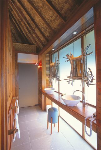
<div class="img-container"><img src="../images/3.jpg" alt="bath"></div>
</div>
</div>
<style>
.box, .box-vw {background-color: green;border-radius: 1vw; overflow: hidden;margin-bottom: 1.5vw;}
.box:nth-of-type(2) {width: 26vw; }
.box-vw .img-container {width: 100vw; height: 66.620879vw; padding-bottom: inherit;}
.img-container {width: 100%; height: 0;/* Aspect ratio of picture*/padding-bottom: 66.620879%;}
img {width: 100%;}
</style>