text overlay using a vanilla div element
text overlay using CSS pseudo-element
revision:
Image overlay is the technique of adding text or images over another base image. One of the simplest ways to add image or text overlay is using CSS properties and pseudo-elements.
CSS overlay effects are achieved by using the following:
- background-image and background CSS properties to add image and linear-gradient overlay effect;
- position: absolute, top, bottom, right, left CSS properties to control the position of overlay image or text;
- ::after and ::before CSS pseudo-elements along with "content CSS property" to control the content in case of text overlay.
There are two types of overlay:
- image overlay: adding image over an image, e.g., watermarked images where you see a logo on top of an image.
- text overlay: adding text over an image, e.g., hero images, marketing banners.
<div class="grid_A">
<div class="example">
<h3>text overlay using a vanilla div element</h3>
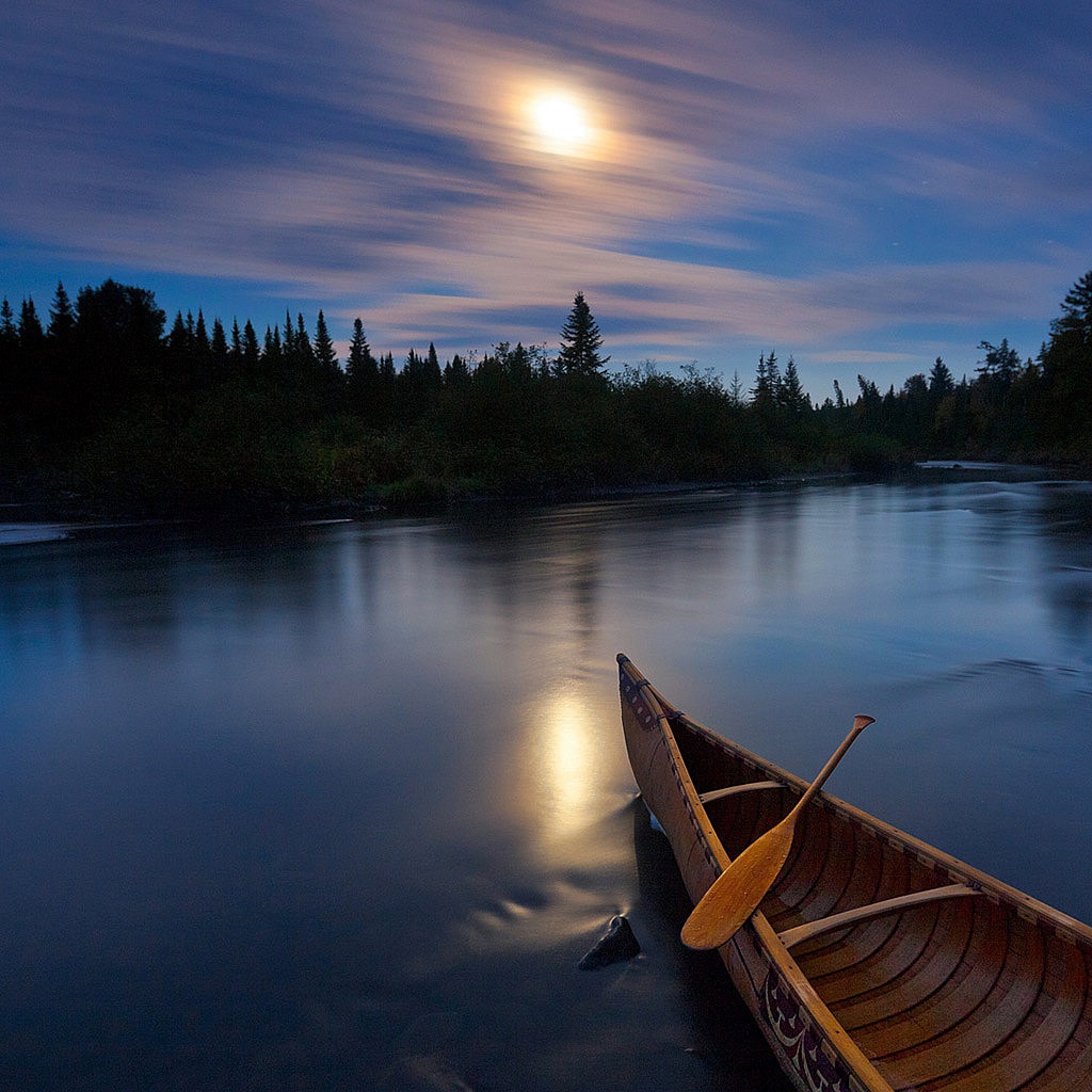
<img class="background-image" src="../images/1.jpg">
<div class="overlay">Multi-line<br/>text</div>
</div>
<div class="example_a">
<h3>text overlay using CSS pseudo-element</h3>
<img class="background-image_a" src="../images/1.jpg">
</div>
</div>
<style>
.example img {width: 65%; position: relative; }
.example .overlay {position: absolute; top: 60vw; left:10vw; font-weight: bold; text-align: right; font-size: 2vw; color: white; z-index: 10;}
.example_a img{width: 33vw; height: auto;}
.example_a::after {content: "Multi-line\00000a text"; position: absolute; top: 60vw; white-space: pre; left: 60vw; font-weight: bold; text-align: right; font-size: 2vw; color:pink;}
</style>
<div class="grid_A">
<div>
<h3>image gradient overlay effect</h3>
<header class="header1">
<section class='hero-header'>
<h3>Hero title</h3>
<h4>Another landing page</h4>
<button>Sign-up</button>
</section>
</header>
</div>
<div>
<h3>image gradient overlay effect</h3>
<header class="header2">
<section class='hero-header1'>
<h3>Hero title</h3>
<h4>Another landing page</h4>
<button>Sign-up</button>
</section>
</header>
</div>
</div>
<style>
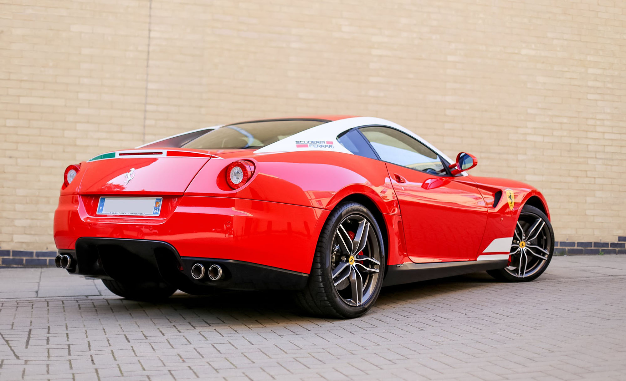
.header1 { height: 15vw; width: 100%; text-align: center; padding-top: 10vw; color: white; overflow: hidden; background: skyblue; /* fallback for old browsers */ background: linear-gradient(rgb(72,0,72,0.8),
rgb(192,72,72,0.8)), url("../images/car2.jpg"); /* Chrome 10-25, Safari 5.1-6 */ background: linear-gradient(rgb(72,0,72,0.8), rgb(192,72,72,0.8)), url("../images/car2.jpg"); /* W3C, IE 10+/ Edge,
Firefox 16+, Chrome 26+, Opera 12+, Safari 7+ */ background-size: cover; background-repeat:no-repeat;}
.header2 { height: 15vw; width: 100%; text-align: center; padding-top: 10vw; color: black; overflow: hidden; background: lightblue; /* fallback for old browsers */ background: linear-gradient(lightblue, lightgreen),
url("../images/car2.jpg"); /* Chrome 10-25, Safari 5.1-6 */ background: linear-gradient(lightblue, lightgreen), url("../images/car2.jpg"); /* W3C, IE 10+/ Edge, Firefox 16+, Chrome 26+, Opera 12+, Safari 7+ */
background-size: cover; background-repeat:no-repeat;}
</style>
Hover over the image to see the effect.

Hover over the image to see the effect.
        <div class="grid_A">
            <div>
                <h3>image overlay - fade</h3>
                <p class="spec">Hover over the image to see the effect.</p>
                <div class="container">
                <img src="../images/facebook.png" alt="facebook" class="image">
                <div class="overlaying">
                    <div class="text">social media</div>
                </div>
                </div>
            </div>
            <div>
                <h3>image overlay - slide</h3>
                <p class="spec">Hover over the image to see the effect.</p>
                <div class="container_a">
                    <img src="../images/facebook.png" alt="facebook" class="image_a">
                    <div class="overlaying_a">
                        <div class="text_a">social media</div>
                    </div>
                </div>
            </div>
        </div>
        <style>
            .container {position: relative; width: 60%; }
            .image { display: block; width: 100%; height: auto; }
            .overlaying { position: absolute; top: 0; bottom: 0; left: 0; right: 0; height: 100%; width: 100%;  opacity: 0; transition: .5s ease; background-color: #008CBA; }
            .container:hover .overlaying {opacity: 1;}
            .text {color: white;font-size: 2vw; position: absolute; top: 50%; left: 50%;-webkit-transform: translate(-50%, -50%); -ms-transform: translate(-50%, -50%); transform: translate(-50%, -50%);
                text-align: center;}

            .container_a {position: relative; width: 60%; }
            .image_a { display: block; width: 100%; height: auto; }
            .overlaying_a { position: absolute; bottom: 100%; left: 0; right: 0; width:100%; height: 0; overflow: hidden;  transition: .5s ease; background-color: #008CBA; }
            .container_a:hover .overlaying_a {bottom: 0; height: 100%;}
            .text_a {color: white;font-size: 2vw; position: absolute; top: 50%; left: 50%;-webkit-transform: translate(-50%, -50%); -ms-transform: translate(-50%, -50%); transform: translate(-50%, -50%);
                text-align: center;}
        </style>
Hover over the image to see the effect.
Hover over the image to see the effect.
        <div class="grid_A">
            <div>
                <h3>image overlay - zoom</h3>
                <p class="spec">Hover over the image to see the effect.</p>
                <div class="container_b">
                <img src="../images/facebook.png" alt="facebook" class="image_b">
                <div class="overlaying_b">
                    <div class="text_b">social media</div>
                </div>
                </div>
            </div>
            <div>
                <h3>image overlay - title</h3>
                <p class="spec">Hover over the image to see the effect.</p>
                <div class="container_c">
                    <img src="../images/facebook.png" alt="facebook" class="image_c">
                    <div class="overlaying_c">Social media!!</div>
                </div>
            </div>
        </div>
        <style>
            .container_b {position: relative; width: 60%;}
            .image_b {display: block; width: 100%; height: auto;}
            .overlaying_b {position: absolute; bottom: 0; left: 0; right: 0; background-color: #008CBA; overflow: hidden;  width: 100%; height: 100%; -webkit-transform: scale(0); -ms-transform: scale(0);
            transform: scale(0); -webkit-transition: .3s ease;  transition: .3s ease;}
            .container_b:hover .overlaying_b {-webkit-transform: scale(1); -ms-transform: scale(1); transform: scale(1);}
            .text_b{color: white;font-size: 2vw; position: absolute; top: 50%; left: 50%;  -webkit-transform: translate(-50%, -50%); -ms-transform: translate(-50%, -50%);  transform: translate(-50%, -50%);
            text-align: center;}
            .container_c {position: relative; width:60%; max-width: 30vw; }
            .image_c { display: block; width: 100%; height: auto;}
            .overlaying_c {position: absolute; bottom: 0; background: rgb(0, 0, 0); background: rgba(0, 0, 0, 0.5); /* Black see-through */ color: #f1f1f1; width: 60%; transition: .5s ease; opacity:0; color: white;
                font-size: 2vw; padding: 2vw; text-align: center; }
            .container_c:hover .overlaying_c {margin-left: 5vw; opacity: 1;}
        </style>
        <style>
            #overlayer {position: fixed; display: none; width: 100%;  height: 100%; top: 0; left: 0; right: 0; bottom: 0; background-color: rgba(0,0,0,0.5); z-index: 2; cursor: pointer; }
            #text_d{ position: absolute; top: 50%; left: 50%; font-size: 5vw; color: pink; transform: translate(-50%,-50%); -ms-transform: translate(-50%, -50%);
            }
        </style>
        <div>
            <div id="overlayer" onclick="off()">
                <div id="text_d">Overlay Text</div>
            </div>
            <div style="padding:2vw">
                <h4>Overlay with Text</h4>
                <button onclick="on()">Turn on overlay effect</button>
            </div>
        </div>
        <script>
            function on() {
            document.getElementById("overlayer").style.display = "block";
            }
            function off() {
                document.getElementById("overlayer").style.display = "none";
            }
        </script>

            <div class="grid_A">
                <div>
                    <style>
                        .thumb-wrapper {position:relative;}
                        .thumb-wrapper img{width:70%;	height:auto;}
                        .thumb-wrapper span {position:absolute; top: 0; bottom:0; left: 0;	right:0; width: 100%; height: 100%; z-index: 1; background: transparent url('../images/play-button.png') no-repeat;
                        background-position: center;}
                    </style>
                    <div>
                        <h3>overlay image over image using "background" property</h3>
                        <div class="thumb-wrapper">
                            <img src="../images/1.jpg" alt="holiday"/><span></span>
                        </div>
                    </div>
                </div>
                <div>
                    <style>
                        .parent-img{ position: relative; width: 35vw; height: auto;}
                        .parent-img-responsive{width:70%; height:auto;}
                        .child-img{position: absolute; top: 0; left: 0; right: 0;}
                    </style>
                    <div>
                        <h3>place an image over an image using "position" property</h3>
                        <div class="parent-img">
                            <img src="../images/1.jpg" class="parent-img-responsive" />
                            <img src="../images/play-button.png" class="child-img"/>
                        </div>
                    </div>
                </div>
            </div>

        <div class="grid_A">
            <div>
                <style>
                    .box {position: relative; text-align: center; color: seagreen; text-emphasis: bold; font-size: 1.5vw;}
                    .bottom-left {position: absolute; bottom: 1vw; left: 1vw;}
                    .top-left {position: absolute; top: 1vw; left: 1vw;}
                    .top-right {position: absolute; top:1vw; right: 1vw;}
                    .bottom-right {position: absolute; bottom: 1vw; right: 1vw;}
                    .centered {position: absolute; top: 50%; left: 50%; transform: translate(-50%, -50%);}
                </style>
                <div>
                    <h3>overlaying text on images using "position" in CSS</h3>
                    <div class="box">
                        <img src="../images/car2.jpg" alt="car" style="width:100%;">
                        <div class="bottom-left">bottom left</div>
                        <div class="top-left">top left</div>
                        <div class="top-right">top right</div>
                        <div class="bottom-right">bottom right</div>
                        <div class="centered">centered</div>
                    </div>
                </div>
            </div>
            <div>
                <style>
                    .box_a {border:1px solid #ccc; padding:0.5vw; height:30vw; width:30vw;}
                    .over{background:rgba(0, 0, 0, .75); text-align:center; opacity:0; width:100%;height:100%; -webkit-transition: all 0.3s ease-in-out; -moz-transition: all 0.3s ease-in-out;
                         -o-transition: all 0.3s ease-in-out; -ms-transition: all 0.3s ease-in-out; transition: all 0.3s ease-in-out;}
                    .box_a:hover {border:1px solid #555; border-radius:0.5vw;}
                    .box_a:hover .over{opacity:1;}
                    .search {position:relative; top:6vw;}
                </style>
                <div>
                    <h3>overlay using the "opacity" property</h3>
                    <div class="box_a" style="background:url(../images/1.jpg) no-repeat 100% 100%;">
                        <a href="#"><div class="over">
                        <span class="search"><img src="../images/search.png"></span>
                        </div></a>
                    </div>
                </div>
            </div>
        </div>
            <div class="grid_A">
                <div>
                    <style>
                        .image-stack {display: grid; grid-template-columns:repeat(12, fr); position: relative; }
                        .image-stack__item--top {grid-column: 1 /span 12;grid-row: 1; padding-top: 10%; margin-left: -3vw; z-index: 1;}
                        .image-stack__item--bottom {grid-column: 4/-1; grid-row:1; }

                    </style>
                    <div>
                        <h3>grid method</h3>
                        <div class="image-stack">
                            <div class="image-stack__item image-stack__item--top">
                            <img src="../images/1.jpg" alt="" class="pic" style="width:20vw; height: auto;"/>
                            </div>
                            <div class="image-stack__item image-stack__item--bottom">
                            <img src="../images/car2.jpg" alt="" class="pic" style="width:33vw; height: auto;"/>
                            </div>
                        </div>
                    </div>
                </div>
                <div>
                    <style>
                        .image-stack {display: grid; grid-template-columns:repeat(12, fr); position: relative; }
                        .image-stack__item--top {grid-column: 1 /span 12;grid-row: 1; padding-top: 10%; margin-left: -3vw; z-index: 1;}
                        .image-stack__item--bottom {grid-column: 4/-1; grid-row:1; }

                    </style>
                    <div>
                        <h3>grid method</h3>
                        <div class="image-stack">
                            <div class="image-stack__item image-stack__item--top">
                            <img src="../images/car2.jpg" alt="" class="pic" style="width:20vw; height: auto;"/>
                            </div>
                            <div class="image-stack__item image-stack__item--bottom">
                            <img src="../images/1.jpg" alt="" class="pic" style="width:33vw; height: 23vw;"/>
                            </div>
                        </div>
                    </div>
                </div>
            </div>
        <div class="grid_A">
            <div>
                <style>
                    .banner {position: relative; min-height: 6vw background-image: url(../images/car2.jpg);background-size: cover; display: flex;}
                    .banner::after {content: ""; position: absolute; top: 0; left: 0; width: 100%; height: 100%;   background-image: linear-gradient(120deg, #eaee44, #33d0ff); opacity: .7; z-index: 1;  mix-blend-mode: color; mix-blend-mode: hue; mix-blend-mode: hard-light;  transform: skew(15deg) translateX(-50%);}
                    .banner > * { z-index: 100; }
                </style>
                <div>
                    <h3>use CSS ::before and ::after for image overlays</h3>
                    <section class="banner">
                        <h3>Hello World</h3>
                    </section>
                </div>
            </div>
            <div>
                <style>
                .wp-caption {position: relative; padding: 0; margin: 0; width: 40vw; height: 30vw;}
                .wp-caption img {display: block; width: 100%; height: 100%;}
                .wp-caption:after {content: ""; position: absolute; display: block; left: 0;  top: 0; width: 100%; height: 100%; background: rgba(0, 0, 0, 0) linear-gradient(to bottom, rgba(0, 0, 0, 0) 0px, rgba(0, 0, 0, 0.6) 100%)
                repeat 0 0; z-index: 1;}
                .wp-caption-text {display: block; position: absolute; width: 100%; color: #fff; left: 10vw;   bottom: 0;  padding: 1vw; font-weight: 700; z-index: 2; -webkit-box-sizing: border-box;
                    box-sizing: border-box; }
                </style>
                <div>
                    <h3>add caption to images</h3>
                    <figure class="wp-caption">
                        <img class="demo" src="../images/1.jpg" alt="Image" />
                        <figcaption class="wp-caption-text">This is a caption text</figcaption>
                    </figure>
                </div>

            </div>
        </div>
        <div style="width: 30vw; height: 30vw; background:skyblue">
            <div><img src=../images/3.jpg id='i1' style="position:relative; left: 10vw; top: 5vw;" width="300" height="300"></div><br><br><br><br>
            <input type=button onClick="move_img('up')" value='Up'><br>
            <input type=button onClick="move_img('left')" value='Left'><br>
            <input type=button onClick="move_img('right')" value='right'><br>
            <input type=button onClick="move_img('down')" value='down'><br>

        </div>
        <script>
            function move_img(str) {
                switch(str){
                    case "down": document.getElementById('i1').style.top=200 + "px";
                    break;
                    case "up":
                    document.getElementById('i1').style.top=10 + "px";
                    break;

                    case "left":
                    document.getElementById('i1').style.left=45 + "px";
                    break;
                    case "right":
                    document.getElementById('i1').style.left=200 + "px";
                    break;

                }
            }
        </script>

        <div class="grid_A">
            <div>
                <div>
                    <div class="thumb-wrapper_a">
                        <img src="../images/1.jpg" alt="thumb" /><span></span>
                    </div>

                </div>
                <style>
                    .thumb-wrapper_a {position:relative;}
                    .thumb-wrapper_a img{width:100%;height:auto;}
                    .thumb-wrapper_a span {position:absolute; top: 0;bottom:0; left: 0;right:0;width: 100%; height: 100%;	z-index: 100; background: transparent url(../images/happy.png) no-repeat;
                        background-position:center;}
                </style>
            </div>
            <div>
                <div>
                    <div class="parent-img">
                        <img src="../images/3.jpg" class="parent-img-responsive" />
                        <img src="../images/sad.png" class="child-img"/>
                    </div>
                </div>
                <style>
                    .parent-img{position: relative;}
                    .parent-img-responsive{width:100%; height:auto;}
                    .child-img{position: absolute; top: 0; left: 0; right: 0;}
                </style>
            </div>
        </div>