code:
<img src="../pics/car2.jpg" style="width:100%;">
revision:
Responsive web design is about using HTML and CSS to automatically resize, hide, shrink, or enlarge a website, to make it look good on all devices (desktops, tablets, and phones).
To create a responsive website, add the following <meta> tag to all your web pages: <meta name="viewport" content="width=device-width, initial-scale=1.0">.
This will set the viewport of your page, which will give the browser instructions on how to control the page's dimensions and scaling.
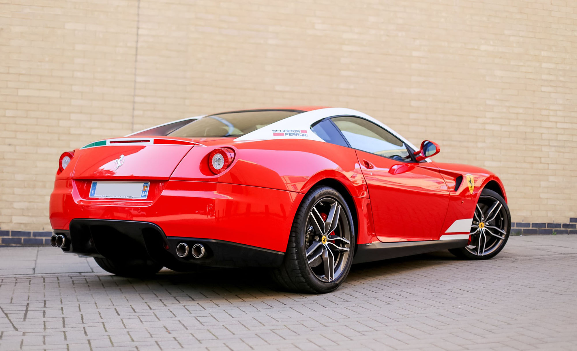
Responsive images are images that scale nicely to fit any browser size.
using the width property: if the "CSS width property" is set to 100%, the image will be responsive and scale up and down.
examples
<img src="../pics/car2.jpg" style="width:100%;">
A better solution, in many cases, will be to use the max-width property. If the "max-width property" is set to 100%, the image will scale down if it has to, but never scale up to be larger than its original size.
examples
<img src="../pics/car2.jpg" style="max-width:100%; height:auto;">
examples
                    <picture>
                        <source srcset="../pics/img_smallflower.jpg" media=
                        "(max-width: 600px)">
                        <source srcset="../pics/img_flowers.jpg" media=
                        "(max-width: 1500px)">
                        <source srcset="../pics/flowers.jpg">
                        <img src="../pics/img_flowers.jpg" alt="Flowers"
                        style="width:auto;">
                    </picture>
The text size can be set with a "vw" unit, which means the "viewport width". That way the text size will follow the size of the browser window:
examples
Resize the browser window to see how the text size scales.
Use the "vw" unit when sizing the text. 2vw will set the size to 2% of the viewport width.
                    <div>
                        <h4 style="margin-left:4vw; font-size:4vw;">Responsive Text</h4>
                        <p class="spec" style="margin-left: 4vw; font-size:3vw;">Resize the browser
                        window to see how the text size scales.</p>
                        <p class="spec" style="margin-left:4vw; font-size:2vw;">Use the "vw" unit
                        when sizing the text. 2vw will set the size to 2% of the viewport width.</p>
                    </div>
In addition to resize text and images, it is also common to use media queries in responsive web pages. With media queries you can define completely different styles for different browser sizes.
examples
If the screen size is less than 800px, then this section will show lightblue color. Otherwise it will show a pink color.
                    <section>
                        the color of this section will change in function of the screen size.
                    </section>
                    <style>
                            section{margin-left:5vw; width: 40vw; height: 10vw; background:pink; border:
                                0.2vw dashed orange;}
                            @media screen and (max-width: 800px) {
                                section{background-color: lightblue;}
                            }
                    </style>