Shanghai one
Shanghai opera

revision:
The CSS Grid Layout Module, with rows and columns, makesg it easier to design web pages without having to use "floats" and "positioning".
A grid layout consists of a parent element, with one or more child elements.
The grid layout must have a parent element with the display property set to "grid" or "inline-grid".
Direct child element(s) of the grid container automatically becomes grid items.
                <style>
                    .grid-container { display: grid; grid-template-columns: auto auto auto; background-color: #2196F3; padding: 10px; height: 15vw;}
                    .grid-item { background-color: rgba(255, 255, 255, 0.8); border: 1px solid rgba(0, 0, 0, 0.8); padding: 20px; font-size: 30px;
                        text-align: center;}
                </style>
                <div style="margin-left: 2vw;" class="grid-container">
                    <div class="grid-item">1</div>
                    <div class="grid-item">2</div>
                    <div class="grid-item">3</div>
                    <div class="grid-item">4</div>
                    <div class="grid-item">5</div>
                    <div class="grid-item">6</div>
                    <div class="grid-item">7</div>
                    <div class="grid-item">8</div>
                    <div class="grid-item">9</div>
                </div>
An HTML element becomes a grid container when its display property is set to grid or inline-grid. All direct children of the grid container automatically become grid items.
The vertical lines of grid items are called grid columns or columns. The horizontal lines of grid items are called grid rows or rows.
The spaces between each column/row are called grid-gaps or gaps. The gap size can be adjusted by using one of the following properties: grid-column-gap, grid-row-gap, grid-gap
                <style>
                    .grid-container1 { display: grid; grid-column-gap: 50px; grid-row-gap: 50px;grid-template-columns: auto auto auto;
                        background-color: #2196F3;
                    padding: 10px; height: 20vw;}
                    .grid-item {background-color: rgba(255, 255, 255, 0.8); border: 1px solid
                        rgba(0, 0, 0, 0.8); padding: 20px; font-size: 30px;  text-align: center;}
                </style>
                <div style="margin-left: 3vw;" class="grid-container1">
                    <div class="grid-item">1</div>
                    <div class="grid-item">2</div>
                    <div class="grid-item">3</div>
                    <div class="grid-item">4</div>
                    <div class="grid-item">5</div>
                    <div class="grid-item">6</div>
                    <div class="grid-item">7</div>
                    <div class="grid-item">8</div>
                    <div class="grid-item">9</div>
                </div>
The grid-gap property is a shorthand property for the grid-row-gap and the grid-column-gap properties. Example: "grid-gap: 50px 100px;".
The grid-gap property can also be used to set both the row gap and the column gap in one value. Example" "grid-gap: 25px;".
Grid lines: the lines between columns are called "column lines" and the lines between rows are called "row lines".
One can refer to line numbers when placing a grid item in a grid container.
                <style>
                    .grid-container2 {display: grid; grid-template-columns: auto auto auto; grid-gap: 10px;
                        background-color: #2196F3; padding: 10px; height: 20vw;}
                    .grid-container2 > div {background-color: rgba(255, 255, 255, 0.8);  text-align: center; padding: 20px 0; font-size: 30px;}
                    .grid-container2 .item1 {grid-column-start: 1; grid-column-end: 3;}
                    .grid-container2 .item3 {grid-row-start: 2; grid-row-end: 4;}
                    .grid-item {background-color: rgba(255, 255, 255, 0.8); border: 1px solid rgba(0, 0, 0, 0.8); padding: 20px; font-size: 30px;
                        text-align: center;}
                </style>
                <div style="margin-left: 2vw;" class="grid-container2">
                    <div class="item1">1< /div>
                    <div class="item2">2</div>
                    <div class="item3">3</div>
                    <div class="item4">4</div>
                    <div class="item5">5</div>
                    <div class="item6">6</div>
                    <div class="item7">7</div>
                    <div class="item8">8</div>
                </div>
To make an HTML element behave as a grid container, you have to set the display property to grid or inline-grid. Grid containers consist of grid items, placed inside columns and rows.
The grid-template-columns property defines the number of columns in the grid layout, and it can define the width of each column.
The value is a space-separated-list, where each value defines the width of the respective column. If you want your grid layout to contain 4 columns, specify the width of the 4 columns, or "auto" if all columns should have the same width.
                <style>
                    .grid-container3 { display: grid; grid-template-columns: auto auto auto auto; grid-gap: 10px; background-color: #2196F3;
                        padding: 10px; height:20vw;}
                    .grid-container3 > div { background-color: rgba(255, 255, 255, 0.8); text-align: center; padding: 20px 0; font-size: 30px;}
                </style>
                <div style="margin-left: 2vw;" class="grid-container3">
                    <div>1</div>
                    <div>2</div>
                    <div>3</div>
                    <div>4</div>
                    <div>5</div>
                    <div>6</div>
                    <div>7</div>
                    <div>8</div>
                </div>
If you have more than 4 items in a 4 columns grid, the grid will automatically add a new row to put the items in.
The grid-template-columns property can also be used to specify the size (width) of the columns.
                <style>
                    .grid-container4 {display: grid; grid-template-columns: 80px 200px auto 30px; grid-gap: 10px; background-color: #2196F3;
                        padding: 10px; height: 20vw;}
                    .grid-container4 > div {background-color: rgba(255, 255, 255, 0.8); text-align: center; padding: 20px 0; font-size: 30px;}
                </style>
                <div style="margin-left: 2vw;" class="grid-container4">
                    <div>1</div>
                    <div>2</div>
                    <div>3</div>
                    <div>4</div>
                    <div>5</div>
                    <div>6</div>
                    <div>7</div>
                    <div>8</div>
                </div>
The grid-template-rows property defines the height of each row. The value is a space-separated-list, where each value defines the height of the respective row.
                <style>
                .grid-container5 { display: grid; grid-template-columns: auto auto auto; grid-template-rows: 80px 200px; grid-gap: 10px;
                background-color: #2196F3; padding: 10px; height: 20vw;}
                .grid-container5 > div { background-color: rgba(255, 255, 255, 0.8); text-align: center; padding: 20px 0; font-size: 30px;}
                </style>
                <div style="margin-left: 2vw;" class="grid-container5">
                    <div>1</div>
                    <div>2</div>
                    <div>3</div>
                    <div>4</div>
                    <div>5</div>
                    <div>6</div>
                </div>
The justify-content property is used to align the whole grid inside the container. The grid's total width has to be less than the container's width for the justify-content property to have any effect.
Values: space-evenly, space-around, space-between, center, start, end.
                <style>
                    .grid-container6 {display: grid; justify-content: space-evenly; grid-template-columns: 50px 50px 50px;
                    /*Make the grid smaller than the container*/ grid-gap: 10px;
                    background-color: #2196F3; padding: 10px; height: 20vw;}
                    .grid-container6 > div { background-color: rgba(255, 255, 255, 0.8); text-align: center; padding: 20px 0; font-size: 30px;}
                </style>
                <div style="margin-left: 3vw;" class="grid-container6">
                    <div>1</div>
                    <div>2</div>
                    <div>3</div>
                    <div>4</div>
                    <div>5</div>
                    <div>6</div>
                </div>
The align-content property is used to "vertically" align the whole grid inside the container. The grid's total height has to be less than the container's height for the align-content property to have any effect.
Values: space-evenly, space-around, space-between, center, start, end.
                <style>
                .grid-container7 { display: grid; height: 400px; align-content: center;  grid-template-columns: auto auto auto; grid-gap: 10px;
                background-color: #2196F3; padding: 10px; height: 20vw;}
                .grid-container7 > div { background-color: rgba(255, 255, 255, 0.8); text-align: center; padding: 20px 0; font-size: 30px;}
                </style>
                <div style="margin-left: 2vw;" class="grid-container7">
                    <div>1</div>
                    <div>2</div>
                    <div>3</div>
                    <div>4</div>
                    <div>5</div>
                    <div>6</div>
                </div>
Child elements (items) are the grid items contained in a grid container. By default, a container has one grid item for each column, in each row, but you can style the grid items so that they will span multiple columns and/or rows.
The grid-column property defines on which column(s) to place an item.
You define where the item will start and where the item will end.
The grid-column property is a shorthand property for the "grid-column-start" and the "grid-column-end" properties. To place an item, you can refer to line numbers or use the keyword "span" to define how many columns the item will span.
Item1 will start on column 1 and end before column 5.
                <style>
                    .grid-container8 { display: grid; grid-template-columns: auto auto auto auto auto auto; grid-gap: 10px; background-color: #2196F3;
                        padding: 10px; height: 20vw;}
                    .grid-container8 > div { background-color: rgba(255, 255, 255, 0.8); text-align: center; padding: 20px 0; font-size: 30px;}
                    .grid-container8 .item1 { grid-column: 1 / 5;}
                    .grid-container8 .item4 {grid-column: 1 / span 3;}
                    .grid-container8 .item14 {grid-column: 1/ span 2;}
                </style>
                <div>
                    <div style="margin-left: 2vw;" class="grid-container8">
                        <div class="item1">1</div>
                        <div class="item2">2</div>
                        <div class="item3">3</div>
                        <div class="item4">4</div>
                        <div class="item5">5</div>
                        <div class="item6">6</div>
                        <div class="item7">7</div>
                        <div class="item8">8</div>
                        <div class="item9">9</div>
                        <div class="item10">10</div>
                        <div class="item11">11</div>
                        <div class="item12">12</div>
                        <div class="item13">13</div>
                        <div class="item14">14</div>
                        <div class="item15">15</div>
                    </div>
                    <p style="margin-left: 5vw">Item1 will start on column 1 and
                    end before column 5.</p>
                </div>
The grid-row property defines on which row to place an item.
You define where the item will start, and where the item will end. The grid-row property is a shorthand property for the "grid-row-start" and the "grid-row-end" properties. To place an item, you can refer to line numbers or use the keyword "span" to define how many rows the item will span.
                <style>
                        .grid-container9 { display: grid; grid-template-columns: auto auto auto auto auto auto; grid-gap: 10px;
                        background-color: #2196F3; padding: 10px; height: 20vw;}
                        .grid-container9 > div { background-color: rgba(255, 255, 255, 0.8); text-align: center; padding: 20px 0; font-size: 30px;}
                        .grid-container9 .item1 { grid-row: 1 / 4;}
                        .grid-container9 .item2 { grid-row: 1 / span 2;}
                </style>
                <div style="margin-left: 2vw;" class="grid-container9">
                    <div class="item1">1</div>
                    <div class="item2">2</div>
                    <div class="item3">3</div>
                    <div class="item4">4</div>
                    <div class="item5">5</div>
                    <div class="item6">6</div>
                    <div class="item7">7</div>
                    <div class="item8">8</div>
                    <div class="item9">9</div>
                    <div class="item10">10</div>
                    <div class="item11">11</div>
                    <div class="item12">12</div>
                    <div class="item13">13</div>
                    <div class="item14">14</div>
                    <div class="item15">15</div>
                    <div class="item16">16</div>
                </div>
The grid-area property can be used as a shorthand property for the "grid-row-start", "grid-column-start", "grid-row-end" and the "grid-column-end" properties.
Item8 will start on row-line 1 and column-line 2, and end on row-line 5 column-line 6.
                <style>
                    .grid-container10 { display: grid; grid-template-columns: auto auto auto auto auto auto; grid-gap: 10px; background-color: #2196F3;
                        padding: 10px; height: 25vw;}
                    .grid-container10 > div { background-color: rgba(255, 255, 255, 0.8); text-align: center; padding: 20px 0; font-size: 30px;}
                    .grid-container10 .item8 { grid-area: 1 / 2 / 5 / 6;}
                </style>
                <div>
                    <div style="margin-left: 3vw;" class="grid-container10">
                        <div class="item1">1</div>
                        <div class="item2">2</div>
                        <div class="item3">3</div>
                        <div class="item4">4</div>
                        <div class="item5">5</div>
                        <div class="item6">6</div>
                        <div class="item7">7</div>
                        <div class="item8">8</div>
                        <div class="item9">9</div>
                        <div class="item10">10</div>
                        <div class="item11">11</div>
                        <div class="item12">12</div>
                        <div class="item13">13</div>
                        <div class="item14">14</div>
                        <div class="item15">15</div>
                    </div>
                    <P style="margin-left: 5vw">Item8 will start on row-line 1 and column-line 2,
                    and end on row-line 5 column-line 6.</P>
                </div>
The grid-area property can also be used to assign names to grid items.
Named grid items can be referred to by the "grid-template-areas" property of the grid container. Each row is defined by apostrophes (' '). The column in each row is defined inside the apostrophes, separated by a space. A period sign represents a grid item with no name.
                <style>
                    .grid-container11 .item1 {grid-area: myArea;}
                    .grid-container11 { display: grid; grid-template-areas: 'myArea myArea myArea myArea myArea'; grid-gap: 10px;
                        background-color: #2196F3; padding: 10px; height: 20vw;}
                    .grid-container11 > div { background-color: rgba(255, 255, 255, 0.8); text-align: center; padding: 20px 0; font-size: 30px;}
                </style>
                <div style="margin-left: 3vw;" class="grid-container11">
                    <div class="item1">1</div>
                    <div class="item2">2</div>
                    <div class="item3">3</div>
                    <div class="item4">4</div>
                    <div class="item5">5</div>
                    <div class="item6">6</div>
                </div>
To define two rows, define the column of the second row inside another set of apostrophes.
                <style>
                    .grid-container12 .item1 { grid-area: header; }
                    .grid-container12 .item2 { grid-area: menu; }
                    .grid-container12 .item3 { grid-area: main; }
                    .grid-container12 .item4 { grid-area: right; }
                    .grid-container12 .item5 { grid-area: footer; }
                    .grid-container12 { display: grid; grid-template-areas:
                        'header header header header header header'
                        'menu main main main right right'
                        'menu footer footer footer footer footer';
                    grid-gap: 10px;  background-color: #2196F3; padding: 10px; height: 20vw;}
                    .grid-container12 > div { background-color: rgba(255, 255, 255, 0.8); text-align: center; padding: 20px 0; font-size: 30px;}
                </style>
                <div style="margin-left: 3vw;" class="grid-container12">
                    <div class="item1">Header</div>
                    <div class="item2">Menu</div>
                    <div class="item3">Main</div>
                    <div class="item4">Right</div>
                    <div class="item5">Footer</div>
                </div>
The order of the items: the grid layout allows us to position the items anywhere we like. The first item in the HTML code does not have to appear as the first item in the grid.
                <style>
                    .grid-container13 { display: grid;  grid-template-columns: auto auto auto;
                        grid-gap: 10px; background-color: #2196F3; padding: 10px; height: 20vw;}
                    .grid-container13 > div { background-color: rgba(255, 255, 255, 0.8);
                        text-align: center; padding: 20px 0; font-size: 30px;}
                    .grid-container13 .item1 { grid-area: 1 / 3 / 2 / 4; }
                    .grid-container13 .item2 { grid-area: 2 / 3 / 3 / 4; }
                    .grid-container13 .item3 { grid-area: 1 / 1 / 2 / 2; }
                    .grid-container13 .item4 { grid-area: 1 / 2 / 2 / 3; }
                    .grid-container13 .item5 { grid-area: 2 / 1 / 3 / 2; }
                    .grid-container13 .item6 { grid-area: 2 / 2 / 3 / 3; }
                </style>
                <div style="margin-left: 2vw;" class="grid-container13">
                    <div class="item1">1</div>
                    <div class="item2">2</div>
                    <div class="item3">3</div>
                    <div class="item4">4</div>
                    <div class="item5">5</div>
                    <div class="item6">6</div>
                </div>
The grid-auto-flow CSS property controls how the auto-placement algorithm works, specifying exactly how auto-placed items get flowed into the grid. This property may take one of two forms: 1/ a single keyword: one of "row", "column", or "dense", or 2/ two keywords: "row dense" or "column dense".
Values:
row: items are placed by filling each row in turn, adding new rows as necessary. If neither row nor column is provided, row is assumed.
column: items are placed by filling each column in turn, adding new columns as necessary.
dense: "dense" packing algorithm attempts to fill in holes earlier in the grid, if smaller items come up later. This may cause items to appear out-of-order, when doing so would fill in holes left by larger items.
If it is omitted, a "sparse" algorithm is used, where the placement algorithm only ever moves "forward" in the grid when placing items, never backtracking to fill holes. This ensures that all of the auto-placed items appear "in order", even if this leaves holes that could have been filled by later items.
                <style>
                    .grid-container14 {display: grid; grid-template-columns: auto auto auto; grid-template-rows: auto auto; grid-gap: 10px;
                    background-color:  #2196F3;padding: 10px; height: 20vw;}
                    .grid-container14 > div {background-color: rgba(255, 255, 255, 0.8); text-align: center; padding: 20px 0; font-size: 30px;}
                </style>
                <div style="margin-left: 3vw;" class="grid-container14" style="grid-auto-flow:
                column;">
                    <div class="item1">1</div>
                    <div class="item2">2</div>
                    <div class="item3">3</div>
                    <div class="item4">4</div>
                </div>
                <style>
                    .grid-container15 {display: grid; grid-template-columns: auto auto auto; grid-template-rows: auto auto; grid-gap: 10px;
                        background-color:  #2196F3; padding: 10px; HEIGHT: 20VW;}
                    .grid-container15 > div {background-color: rgba(255, 255, 255, 0.8); text-align: center; padding: 20px 0; font-size: 30px;}
                </style>
                <div style="margin-left: 2vw;" class="grid-container14" style="grid-auto-flow: row;">
                    <div class="item1">1</div>
                    <div class="item2">2</div>
                    <div class="item3">3</div>
                    <div class="item4">4</div>
                </div>
With CSS grid layout, the grid itself within its container as well as grid items can be positioned with the following 6 properties: justify-items, align-items, justify-content, align-content, justify-self, and align-self.
These properties, which are part of the CSS box alignment module, define a standard way to position elements with either flexbox or CSS grid.
Most of the alignment properties are applied on the grid container, but some are for grid items, for when you want to specify values that apply only for specific grid items.
justify-items, align-items, justify-content, and align-content are four properties that apply to the entire grid.
"justify-items" is used to justify the grid items along the row axis. The possible values are "start", "end", "center", and "stretch".
                    <div class="container">
                        <div class="item">1</div>
                        <div class="item">2</div>
                        <div class="item">3</div>
                        <div class="item">4</div>
                        <div class="item">5</div>
                        <div class="item">6</div>
                    </div>
                    <style>
                        .container {display: grid; grid-template-columns: 10vw 10vw 10vw; grid-template-rows: auto;
                            box-sizing: border-box; width: 30vw; height: 20vw; margin-left: auto; margin-right: auto;
                            background: transparent; border: 0.3vw dashed orange; justify-items:center;}
                        .item {text-align:center; box-sizing: border-box; width: 5vw; height: 5vw; background: yellow;
                            border: 0.3vw dashed red;}
                    </style>
"align-items" is used to align the grid items along the column axis. The possible values are "start", "end", "center", and "stretch".
                    <div class="container_a">
                        <div class="item_a">1</div>
                        <div class="item_a">2</div>
                        <div class="item_a">3</div>
                        <div class="item_a">4</div>
                        <div class="item_a">5</div>
                        <div class="item_a">6</div>
                    </div>
                    <style>
                        .container_a {display: grid; grid-template-columns: 10vw 10vw 10vw; grid-template-rows: auto;
                            box-sizing: border-box; width: 30vw; height: 20vw; margin-left: auto; margin-right: auto;
                            background: transparent; border: 0.3vw dashed orange;align-items:center;}
                        .item_a {text-align:center; box-sizing: border-box; width: 5vw; height: 5vw; background: yellow;
                            border: 0.3vw dashed red;}
                    </style>
"justify-content": when the entire grid is smaller than the space for the grid container, use justify-content to justify the grid along the row axis. You can use the following values: "start", "end", "center", "stretch", "space-around", "space-between", or "space-evenly".
                <div class="container_b">
                    <div class="item_b">1</div>
                    <div class="item_b">2</div>
                    <div class="item_b">3</div>
                    <div class="item_b">4</div>
                    <div class="item_b">5</div>
                    <div class="item_b">6</div>
                </div>
                <style>
                    .container_b {display: grid; grid-template-columns: 10vw 10vw 10vw; grid-template-rows: auto;
                        box-sizing: border-box; width: 30vw;  height: 20vw; margin-left: auto; margin-right: auto;
                        background: transparent; border: 0.3vw dashed orange; justify-content:space-evenly;}
                    .item_b {text-align:center; box-sizing: border-box; width: 5vw; height: 5vw; background: yellow;
                        border:
                        0.3vw dashed red;}
                </style>
"align-content" is used to align the grid content along the column axis. You can use the following values: "start", "end", "center", "stretch", "space-around", "space-between", or "space-evenly".
                <div class="container_c">
                    <div class="item_c">1</div>
                    <div class="item_c">2</div>
                    <div class="item_c">3</div>
                    <div class="item_c">4</div>
                    <div class="item_c">5</div>
                    <div class="item_c">6</div>
                </div>
                <style>
                    .container_c {display: grid; grid-template-columns: 10vw 10vw 10vw; grid-template-rows: auto;
                        box-sizing: border-box; width: 30vw; height: 20vw; margin-left: auto; margin-right: auto;
                        background: transparent; border: 0.3vw dashed orange;align-content: space-around;}
                    .item_c {text-align:center; box-sizing: border-box; width: 5vw; height: 5vw; background: yellow;
                        border: 0.3vw dashed red;}
                </style>
"justify-self" and "align-self" are analogous to the equivalent properties available on the container (justify-items and align-items), but they apply to items directly to position them differently than the rest of the grid items.
"justify-self" is used to align a grid item along the row axis.
                <div class="container_d">
                    <div class="item_d">1</div>
                    <div class="item_d">2</div>
                    <div class="item_d" style="justify-self:end;">3</div>
                    <div class="item_d">4</div>
                    <div class="item_d">5</div>
                    <div class="item_d">6</div>
                </div>
                <style>
                    .container_d {display: grid; grid-template-columns: 10vw 10vw 10vw; grid-template-rows: auto;
                        box-sizing: border-box; width: 30vw;  height: 20vw; margin-left: auto; margin-right: auto;
                        background: transparent; border: 0.3vw dashed orange; align-content:space-around;}
                    .item_d {text-align:center; box-sizing: border-box; width: 5vw; height: 5vw; background: yellow;
                        border: 0.3vw dashed red;}
                </style>
"align-self" is used to align a grid item along the column axis.
                <div class="container_e">
                    <div class="item_e">1</div>
                    <div class="item_e">2</div>
                    <div class="item_e" style="align-self:end">3</div>
                    <div class="item_e">4</div>
                    <div class="item_e">5</div>
                    <div class="item_e">6</div>
                </div>
                <style>
                    .container_e {display: grid; grid-template-columns: 10vw 10vw 10vw; grid-template-rows: auto;
                        box-sizing: border-box; width: 30vw;  height: 20vw; margin-left: auto; margin-right: auto;
                        background: transparent; border: 0.3vw dashed orange;justify-items:center;}
                    .item_e {text-align:center; box-sizing: border-box; width: 5vw; height: 5vw; background: yellow;
                        border: 0.3vw dashed red;}
                </style>
Using a combination of row axis and column axis CSS grid properties may be necessary to create the grid you desire.
a combination of justify-content: space-evenly, justify-items: center, align-content: space-evenly, and align-items: center:
                <div class="container_e">
                    <div class="item_e">1</div>
                    <div class="item_e">2</div>
                    <div class="item_e" style="align-self:end">3</div>
                    <div class="item_e">4</div>
                    <div class="item_e">5</div>
                    <div class="item_e">6</div>
                </div>
                <style>
                    .container_f {display: grid; grid-template-columns: 10vw 10vw 10vw; grid-template-rows: auto;
                        box-sizing: border-box; width: 30vw; height: 20vw; margin-left: auto; margin-right: auto;
                        background: transparent; border: 0.3vw dashed orange; justify-content: space-evenly;
                        justify-items: center; align-content: space-evenly; align-items: center;}
                    .item_f {text-align:center; box-sizing: border-box; width: 5vw; height: 5vw; background: yellow;
                        border: 0.3vw dashed red;}
                </style>
        <div class="grid_items">
            <div class="grid_item">A <br>Lorem ipsum dolor sit amet. <br>Consectetuer adipiscing elit. <br>Cum sociis natoque penatibus et magnis dis parturient montes. <br>
            nascetur ridiculus mus.</div>
            <div class="grid_item">B</div>
            <div class="grid_item">C  <br>Lorem ipsum dolor sit amet. <br>Consectetuer adipiscing elit.</div>
            <div class="grid_item">D</div>
            <div class="grid_item">E <br>Lorem ipsum dolor sit amet. <br>Consectetuer adipiscing elit. <br>Cum sociis natoque penatibus et magnis dis parturient montes. <br>
            nascetur ridiculus mus.</div>
            <div class="grid_item">F</div>
        </div>
        <style>
            .grid_items {padding: 3.75%; display: grid; grid-template-columns: 100%; grid-column-gap: 0;  grid-row-gap: 20px;}
            .grid_items > div {background-color: RoyalBlue; padding: 10px;}
            .grid_items > div:nth-child(3n + 2) {background-color: DodgerBlue;}
            .grid_items > div:nth-child(3n) {background-color: DeepSkyBlue;}
            @media only screen and (min-width: 640px) {
                .grid_items {grid-template-columns: 47.5% 47.5%; grid-column-gap: 5%; grid-row-gap: 40px;}
                .grid_items > div {padding: 20px;}
            }
            @media only screen and (min-width: 981px) {
                .grid_items {grid-template-columns: 30% 30% 30%; grid-row-gap: 50px;}
                .grid_items > div {padding: 30px;}
            }
        </style>
Shanghai opera
Shanghai Puxi
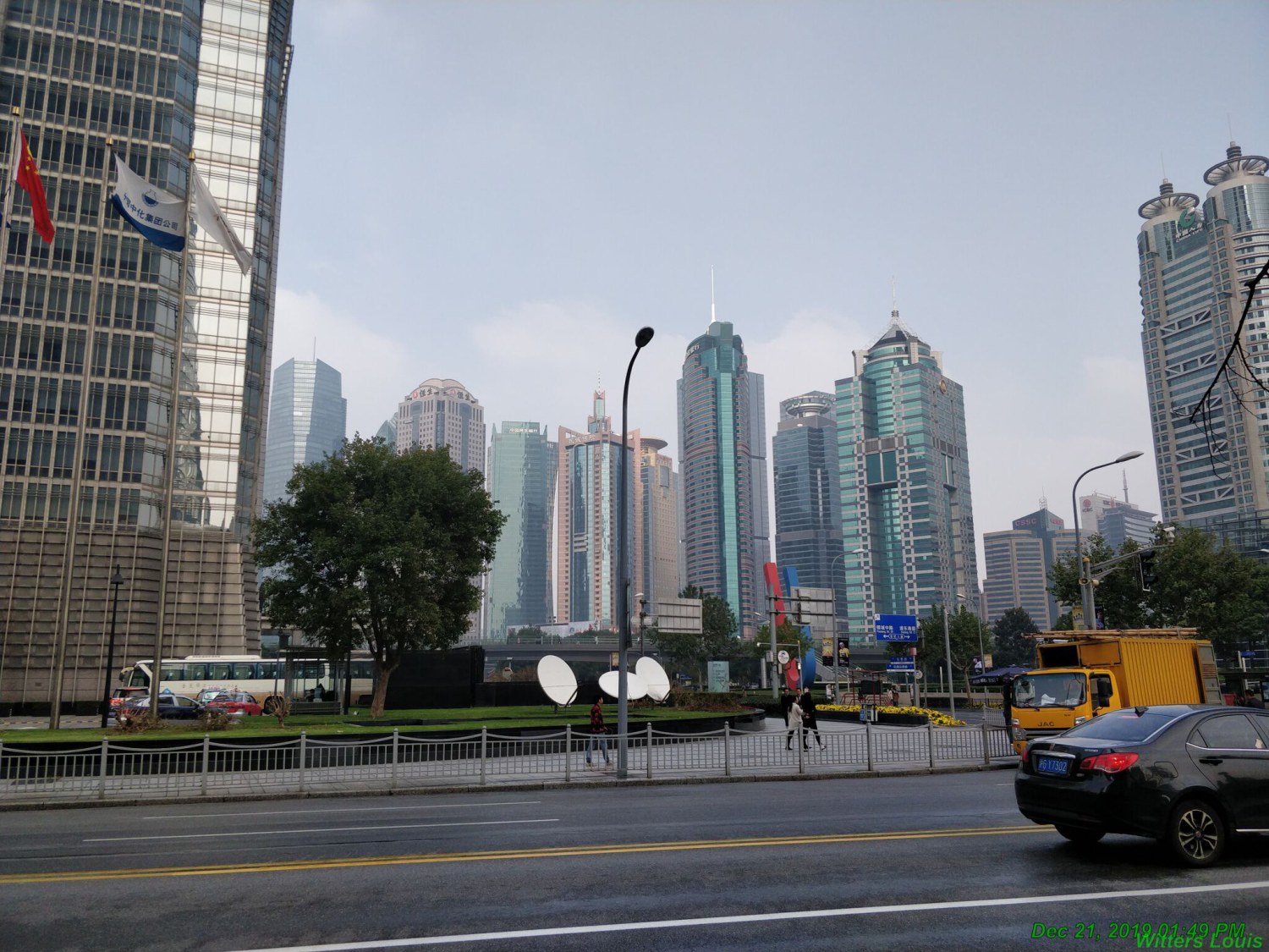
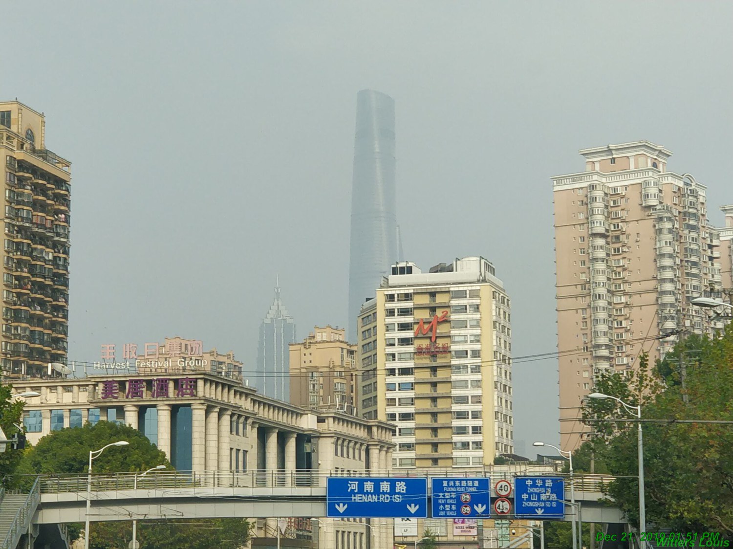
Shanghai tower
Shanghai Huangpu

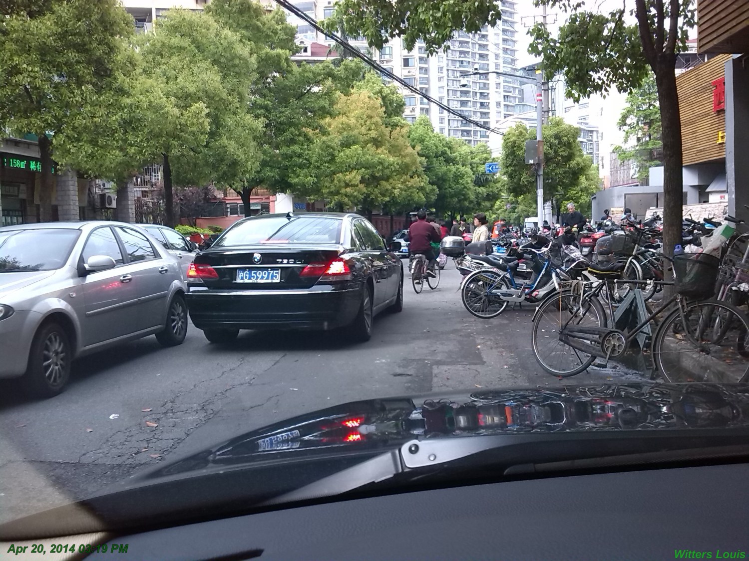
Shanghai street
Shanghai rain

Shanghai flood

Shanghai flood

Shanghai flood

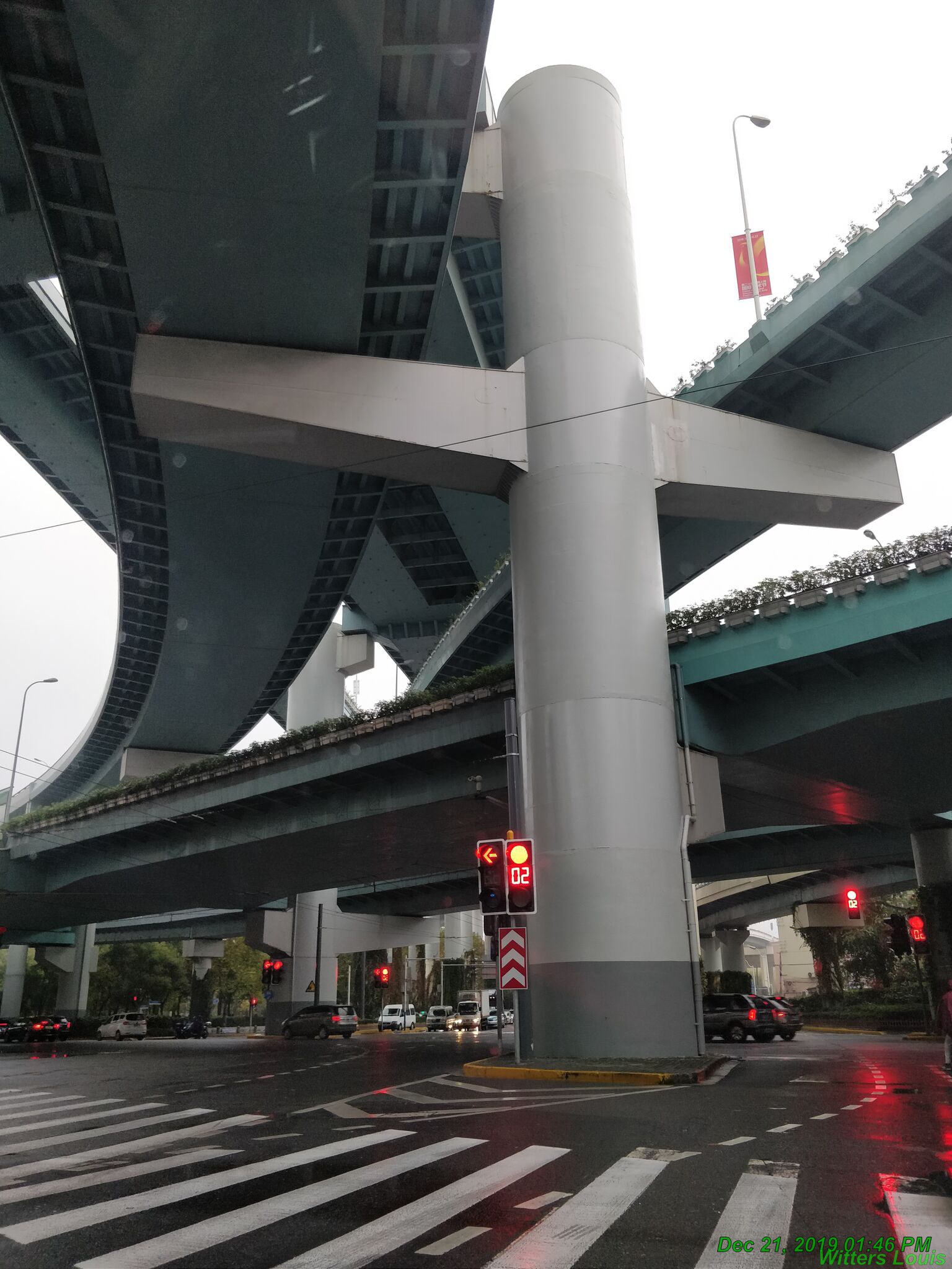
Shanghai highway
Shanghai F1
Shanghai veggies

        <section>
            <div class="rt-container">
                <div class="col-rt-12">
                    <div class="grids">
                        <article>
                            <figure>
                                <h3>Shanghai one</h3>
                                <p>Shanghai opera</p>
                            </figure>
                            <img src="../pics/2018-Sh-01.jpg" alt=""/>
                        </article>
                        <article>
                            <figure>
                            <h3>Shanghai two</h3>
                                <p>Shanghai Puxi</p>
                            </figure>
                            <img alt src='../pics/2018-Sh-02.jpg' />
                        </article>
                        <article>
                            <figure>
                                <h3>Shanghsi three</h3>
                            <p>Shanghai tower</p>
                            </figure>
                            <img alt src='../pics/2018-Sh-03.jpg' />
                        </article>
                        <article>
                            <figure>
                                <h3>Shanghai four</h3>
                            <p>Shanghai Huangpu</p>
                            </figure>
                            <img alt src='../pics/2018-Sh-04.jpg' />
                        </article>
                        <article>
                            <figure>
                                <h3>Shanghai five<h3>
                                    <p>Shanghai street</p>
                            </figure>
                            <img alt src='../pics/2018-Sh-05.jpg' />
                        </article>
                        <article>
                            <figure>
                                <h3>Shanghai six</h3>
                                <p>Shanghai rain</p>
                            </figure>
                            <img alt src='../pics/2018-Sh-06.jpg' />
                        </article>
                        <article>
                            <figure>
                                <h3>Shanghai seven</h3>
                                <p>Shanghai flood</p>
                            </figure>
                            <img alt src='../pics/2018-Sh-07.jpg' />
                        </article>
                        <article>
                            <figure>
                                <h3>Shanghai eight</h3>
                                <p>Shanghai flood</p>
                            </figure>
                            <img alt src='../pics/2018-Sh-08.jpg' />
                        </article>
                        <article>
                            <figure>
                            <h3>Shanghai nine</h3>
                                <p>Shanghai flood</p>
                            </figure>
                            <img alt src='../pics/2018-Sh-09.jpg' />
                        </article>
                        <article>
                            <figure>
                            <h3>Shanghai ten</h3>
                                <p>Shanghai highway</p>
                            </figure>
                            <img alt src='../pics/2018-Sh-10.jpg' />
                        </article>
                        <article>
                            <figure>
                                <h3>Shanghai eleven</h3>
                                <p>Shanghai F1</p>
                            </figure>
                            <img alt src='../pics/2018-Sh-11.jpg' />
                        </article>
                        <article>
                            <figure>
                            <h3>Shanghai twelve</h3>
                                <p>Shanghai veggies</p>
                            </figure>
                            <img alt src='../pics/2018-Sh-12.jpg' />
                        </article>
                </div>

                </div>
            </div>
        </section>
        <style>
            :root {--sinSerif: -apple-system, BlinkMacSystemFont, "Segoe UI", "Roboto", "Oxygen", "Ubuntu", "Cantarell", "Fira Sans", "Droid Sans", "Helvetica Neue", sans-serif;
            --Nhexa: 4; --gap: 2vw;--size: calc(calc(100vw / var(--Nhexa)) - var(--gap));}
            @media only screen and (min-width: 1100px) {
                :root {--Nhexa: 6;}
            }
            @media only screen and (max-width: 600px) {
                :root {--Nhexa: 2;}
                body {margin-right: calc(var(--size) * .3);}
            }
            .grids { margin: calc(var(--size) * .5) auto 0; width: calc(var(--size) * calc(var(--Nhexa) - 1));display: grid; grid-template-columns: repeat(var(--Nhexa), 1fr); grid-gap: var(--gap);
                    display:inline-grid;}
            article {background: cadetblue; width: var(--size); height: calc(var(--size) / 1.1111111);  clip-path: url(#hexagono); clip-path: polygon(25% 0, 75% 0, 100% 50%, 75% 100%, 25% 100%,
                0 50%);margin-right: calc(var(--size) / 2); color: #fff; overflow: hidden;}
            article:nth-child(2n) {margin: calc(var(--size) * -.5) calc(var(--size) * -.25) 0 calc(var(--size) * -.75);}
            article::before {content: ''; float: left; width: 25%; height: 100%; clip-path: polygon(0% 0%, 100% 0%, 0% 50%, 100% 100%, 0% 100%); shape-outside: polygon(0% 0%, 100% 0%,
            0% 50%, 100% 100%, 0% 100%); }
            img {width: var(--size);height: var(--size); position: relative; top: 0%; left: 50%; transform: translate(-50%, -116%); transform-origin: 0% 50%; transition: .75s; clip-path:
                url(#hexagono);clip-path: inherit;z-index:  10; }
            article:hover img { transform: translate(-60%, -60%) rotate(-120deg);}
            figure { display: flex; flex-direction: column; flex-wrap: nowrap; justify-content: center;  max-width: 50%; height: 100%; font-size: calc(9 / var(--Nhexa) * 1vw); line-height: 1; color: #fff;
                transition: .75s .05s; text-align: center;}
            h3 {font-size: 100%;}
            figure p {font-size: 60%; line-height: 1.2; width: 100%;}
        </style>
display: grid;

        grid-template-columns: 20vw 1fr;

        grid-template-rows: 15vw 1fr;
grid-area: 1 / 1 / 2 / 2;
grid-area: 1 / 1 / 2 / 2;
margin-left: 20vw;
Codes:
          <div class="parent">
              <h3>parent<br>
               <code>display: grid;<br>
                grid-template-columns: 20vw 1fr;<br>
                grid-template-rows: 15vw 1fr;<br></code>
              </h3>
              <div class="child">
                  <h3>child 1</h3>
                  <code>grid-area: 1 / 1 / 2 / 2;</code>
              </div>
              <div class="child child2">
                  <h3></h3>child 2</h3>
                  <code>grid-area: 1 / 1 / 2 / 2;</code>
                  <code>margin-left: 20vw;</code>
              </div>
          </div>

          <style>
              div {border-radius: 10px; text-align: left;}
              h3 {font-weight: bold;text-transform: uppercase; letter-spacing: 0.04vw; padding: 0 1vw; margin-bottom: 0.5vw;}
              code {padding: 0.5vw 0vw; font-weight: normal; text-transform: none; font-size: 1.5vw;}
              .parent {display: grid; grid-template-columns: 20vw 1fr; grid-template-rows: 15vw 1fr;  background: lightgreen; width: 40vw; margin: 4vw 5vw; height: 20vw; border: 0.5vw dotted red;}
              .child {grid-area: 1 / 1 / 2 / 2; opacity: 0.8; height: 15vw; background: grey; border: 0.3vw dotted blue; width: 20vw;}
              .child2 {margin-left: 20vw;}
          </style>